
The State of the "With"
The State of the "With"
Even taking the numbers at face value things are not what you have been lead to believe

(Team Reality: Please suspend your weariness about “with” data fraud and follow along.)
So Stanford’s John Ioaniddis’ latest numbers on pandemic IFR are below. As the chart shows, the age distribution of fatality remains hugely skewed/ stratified to the elderly as we have known all along.

I have added “odds” annotations in red. As you can see by this, the death odds stratification shows the 70+ crowd at 3,000 (!) times the risk of the young and 100 times the risk of the middle aged. And less than 5% of “with” deaths below age 60!
Team Fear attacks Ioaniddis that his numbers are all wrong. So let’s do a rough mapping of them onto the current NYC data and see what that looks like. (Note this is NYC itself separated out from NY state.)
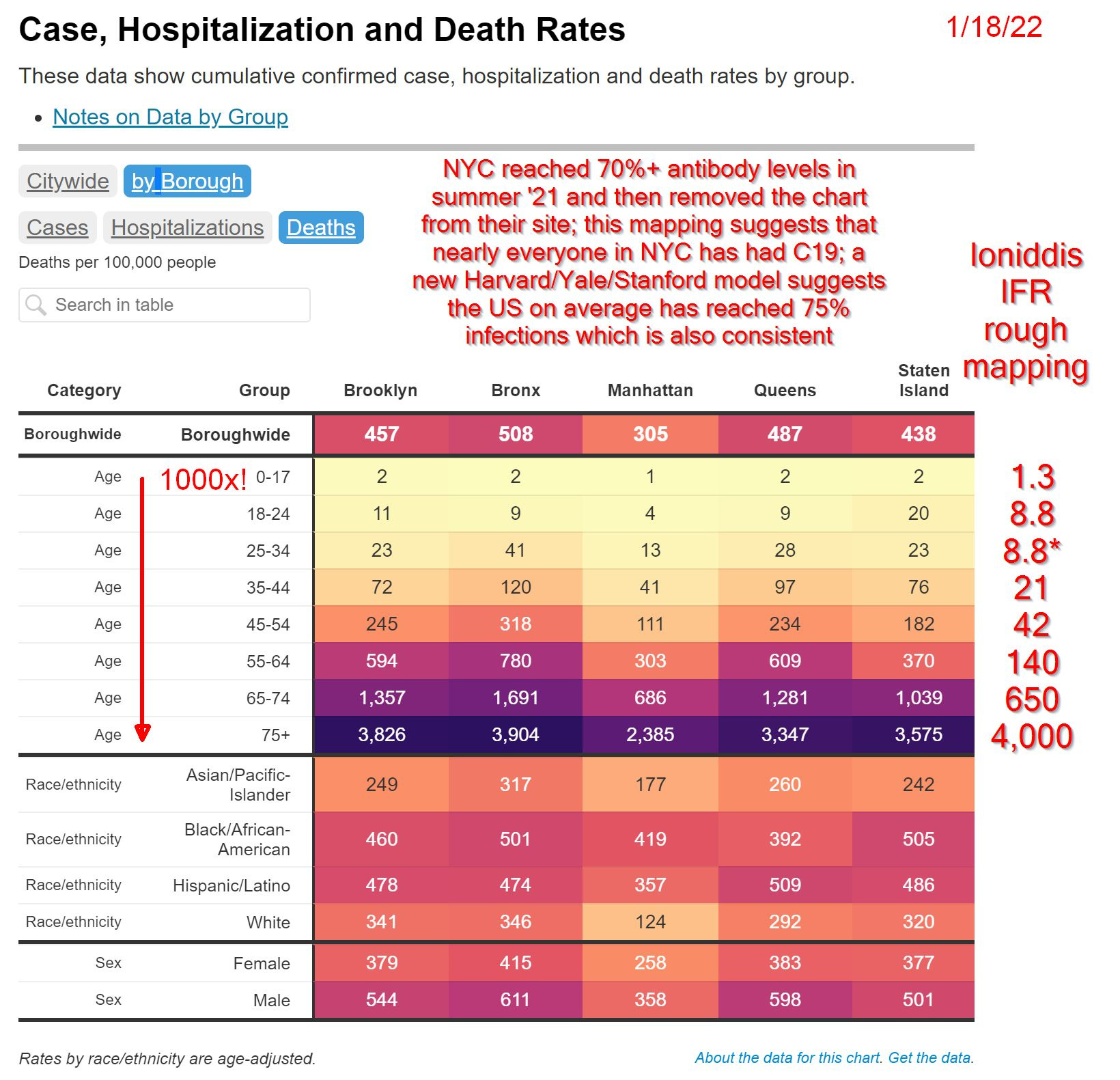
I have had to take some liberties with age binning disparities but certainly we can agree that at the ends of the scales we are tolerably well mapped. This table is also a solid use of color “heat map” tables to help understand the range of difference. (I used this technique in “Sizing Sweden’s Setback” and “Seasonality 102: UK Mortality Heatmap Since 1983”.)
And yep, we see 1,000-2,000x+ disparity from youngest to oldest.
So what does that mean for the young? We see IFR odds of 1 in 76,923! And this includes co-morbidities so the odds for the healthy are MUCH lower. Easily still ranging up into the 1 in hundreds of thousands range as I pointed out in “Mode 86” quite a while back. Literally spitting at lightning strike odds.
No wonder even Walensky had to correct Sotomayor craziness about all the children are dying.
And Ioaniddis’ numbers in the middle cohorts are somewhat lower than NYC which makes some sense since NYC itself is known to have been hit harder in general and harder in the middle age cohorts than most other places due to their sharp first wave.
And even taking the world population as a whole and counting entirely “with”, how can we visualize that? Like this.
And now you see the power of 24/7/365 multimedia propaganda. Check out my “9% Uncorrected” for another angle on how egregious and dishonest the propaganda has all been.
In generalities, the worst of the “with” in the US ranges from 1 in ~700 to 1 in 1,000 deaths per year. One other way to think of that is if you sat in a 1,000 seat auditorium for a year of the pandemic you would see 9 deaths that would have been from other things and 1-2 more “with” C19 compared to a normal year!
And other than that mention of co-morbidities I made, we haven’t even had to resort to bringing “of” into the fray as it properly should be somewhere in the range of <1 to 25% of “with” if they ever stop lying to us and admit the real numbers.
Did I forget to mention that when the NYC table that included classification was last screenshotted by me last summer (because I knew they would take it down since it was getting so outrageous) it showed 0.5% C19 deaths without comorbidities?
And now you know that “<1” percent just above was not a typo!
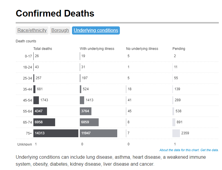
Yeah, that’s why they took it down alright. Not good for the terror virus narrative.

