


Looking at the latest data from the Larimer County, CO C19 site, it turns out that a relatively healthy, low BMI/ high sun/vitamin D exposure population like Larimer does in fact end up looking a lot like a “bad flu”. And that’s likely without much early treatment protocol probably matching the rest of the country but I could be wrong…
And the median age of death is 84 and the mode age of C19 death is 86!
Of course, that can’t be if the young were affected and that is obvious from the youngest C19 death being 25 and the next youngest being 46! And a total of 4 deaths to date under age 50.

Averaged over the 2 seasons of C19 to date, Larimer has C19 death rates of about 20% of the national average for those under 65 and about 40% for those of retirement age.
So if Larimer pre-retirement C19 deaths are scaled to the population of the US then there would be about 11,000 of them a year — hence the 20% estimate .
Another way to look at it is if you have not yet retired, your chance of dying in a car crash is about 2 1/2 times greater than dying of C19 in Larimer.
And of course, if you don’t take the numbers at face value as I am doing here, both the Larimer and US data improve.
What does this look like if we take the US deaths by age data and layer on scaled Larimer C19 deaths instead of reported US C19 deaths to the US “all other causes” deaths? Like this:

The highest orange line (current US reported) drops to the highest dark blue line (Larimer reported scaled to the US population) with the light dashed blue line being US deaths from other causes “baseline”. Obviously a significant drop as expected with the even lower impact on those pre-retirement clearly visible. Given the high median and mode death ages, a large number of deaths are in fact over age 85 but CDC does not have those ages available except in aggregate in the dataset I used.
Finally, what does the comparison of % of increased death risk of C19 over baseline look like for the US vs Larimer?

The Larimer data is noisier due to C19’s relatively low impact on a population of only 360,000 but its much lower risk is clear. Another way to visualize the comparison is that for whatever your age is in these older cohorts (and its corresponding risk of death pre C19), if you illustrate that by holding your hands 10” apart then your new risk with C19 added in Larimer becomes about 10.5” and in the US as a whole about 11.5”.
Of course, as expected Larimer looks much better when looked at this way — but in these older cohorts your risk of death was already becoming meaningful without C19 compared to the young (look at that middle chart again for the young with or without C19!) and middle aged.
But making people aware of my middle chart — even without Larimer’s example — would have put things into a perspective which would have taken the edge off the fear narrative. So no dice to that…
UPDATE 210531: US mortality presented as yearly “odds of death” for C19 and all causes:
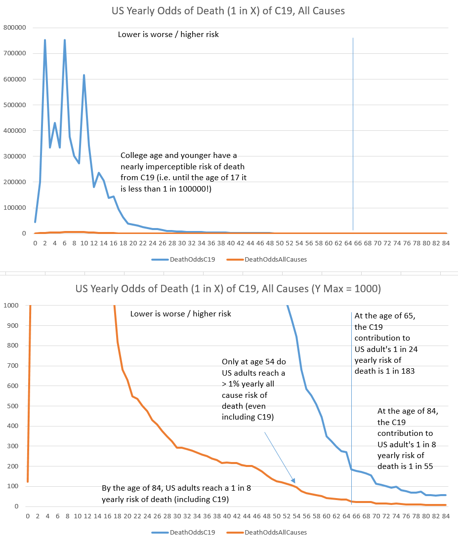
Both charts are linear and zero based. The top chart has no scale limitations so you can see how crazily low the risk of C19 death is for children. Below middle school the risk is actually spitting at 1 in a million as former CDC director Redfield accidentally admitted last year.
The bottom chart is limited to a 1000 Y scale max (which is equivalent to 0.1% = 1 in 1000) and is aimed at providing a perspective from the “other end of the telescope” on all the reassuring 99.XX….% survival tables seen from team reality.
Both charts make clear how hugely age stratified both C19 and all cause risk of death are which is one of the things team fear works hardest to obscure.