

Sizing Sweden's Setback
Overall, C19 caused Sweden to regress to 2013's all cause death rate when there were ... how many lockdowns again?

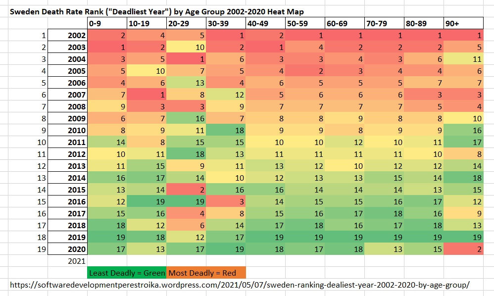
A heatmap chart of Sweden’s historical death rates is particularly instructive:
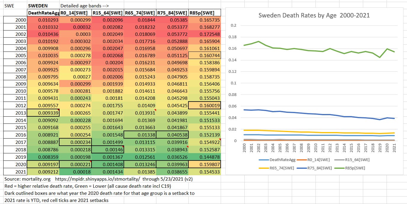
By this analysis Sweden’s overall 2020 death rate is about equivalent to that experienced in 2013.
This is a variant cross-check of an earlier heatmap treatment I did of one of Tommy’s tables (below) since that turned out so interesting. The cross-check is that I used the mortality.org data set with its slightly different age banding.
In this chart I have highlighted in bold boxes the years that each age band’s death rate in 2020 was a “setback” to. Also note the dark green for the higher age bands in 2019 which is quite a graphic display of @FatEmporer ‘s “dry tinder” hypothesis for the elderly as Tommy has now also illustrated yet again at systems perestroika.
The biggest difference is just where it might be expected in the oldest band (85+ vs 90+) where 90+ shows a setback to 2003 instead of 2012 for 85+.


My earlier heatmap of Tommy’s chart:
Needless to say, while these setbacks are unfortunate, the argument that they justify the huge damage caused by lockdowns — remember that Sweden had minimal or no lockdown to boot — is straight up insanity.
As an added bonus, something else from Tommy caught my eye about many older age bands (in addition to the youngest) having lower positivity rates (see top band chart just below). This seems like a good fit to me about how most people get progressively fewer colds (immune build up; this includes me!) as they age until they cross over into frailty and immune senescence where at least rhinovirus colds may cause more deaths than flu!
