

9% Uncorrected
The multimedia virus fear narrative creates errors of multiple orders of magnitude ... on purpose

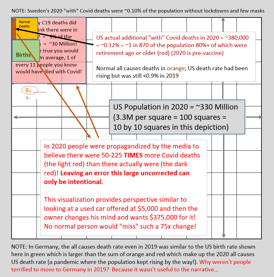
There have been various surveys of what people have come to believe is the casualty rate from the SARS-2 virus. One survey last summer looked across the world and came up with US citizens believing that 9% of the population had died from the virus!
That would look proportionately like the light red rectangle in the lower left on this diagram where the entire US population is represented by the 100 squares within the grey border (take some time to click/enlarge and read and understand the diagram):
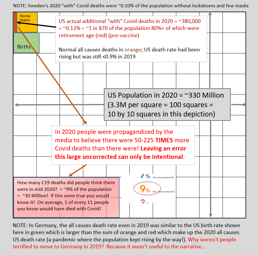
If this were true, on average one out of 11 people the typical US citizen knows would have died from the virus by summer 2020 … implying that by the end of 2020 that maybe 1 out of 5 people might have died!
It doesn’t take much thought to realize that if this were true that the entire economy would have collapsed to the point that everyone was in danger of starvation. This would be a seismic level shock.
Yet the media made no effort to correct this impression at all as any ethical profession would.
In reality, during the whole of 2020 a total of 0.12% (1 in 870 people or 380,000) ended up dying “with” the virus. Let’s just stick with that inflated number even though we know that at minimum a large portion of those were the result of faulty PCR tests, lockdown deaths (e.g. people who died of other causes but were too scared to go to the hospital), infections acquired in various healthcare settings, wrong or missing treatments and almost entirely the old and sick population given the huge age and comorbidity risk multipliers for C19.
That 0.12% looks like the red rectangle in the upper left! It’s easy to see with your own eyes that this is a hugely consequential difference!
And for perspective, the normal “all cause” deaths for 2020 (not due the virus but rather typical causes like heart disease and cancer) are represented by the orange rectangle. This is the level of death that has happened in the US each year recently that nobody gives a second thought to as being a crisis. Note that this normal “all cause” death level of ~0.9% is surprisingly low when you think about it — an intuitive thought by many seeing this would be that perhaps this less than 1 in 100 per year death rate implies that people on average live to be over 100 rather than around 80 as we often hear?!
Also note also that the green rectangle represents births. It’s an interesting pandemic “disaster” where the population continues to grow never mind immigration, isn’t it?
And population growth is even more true for the world in total where the birth rate up until now has been ~140 million a year against a typical ~60 million deaths. (Side note for Coloradoans: Another way to put this is that each day about the population of Fort Collins dies while about the population of its enclosing Larimer county is born!)
By now those with even basic math skills among you are wondering how this massive level of deception happened?
Oh, and reading the text in the grey, how did it happen that Sweden actually had a lower death rate in 2020 than the US at 0.1% (vs 0.12%)? Whenever Sweden is mentioned in the media it is in the context that they did everything wrong and there is nobody left alive there!
And even more interesting, the green rectangle of the US birth rate is actually comparable to the death rate in Germany in 2019 and roughly continuing to now. Why weren’t people terrified to move to Germany in 2019?
Here’s what a comparison of Sweden and Germany’s weekly death rates across the three years of 2019-2021 looks like (not zero based as is proper practice but still a valid linear visual comparison):

As you can see, there is no recent time except a few weeks as the virus hit in 2020 where the average Swedish citizen would have been safer in Germany from a population death rate perspective!
And now you have been able to visualize how VERY powerful multimedia propaganda is in creating false impressions and generating fear.
Yes — on purpose.
UPDATE 210830: Another version of the population diagram that overlays the 0.12% reality directly on top of the 9% propaganda fairy land for an unavoidable visual comparison:
P.S. This analysis focuses on 2020 as that factors out the impact of the gene therapies— more on that to come but in the meantime I highly recommend Alex Berenson’s twitter and substack and Dr Robert Malone for leading edge views of our burgeoning 2021 “leaky vaccine” disaster…