
In Larimer County, CO, Covid Vaccines for the Young Make No Sense
In Larimer County, CO, Covid Vaccines for the Young Make No Sense
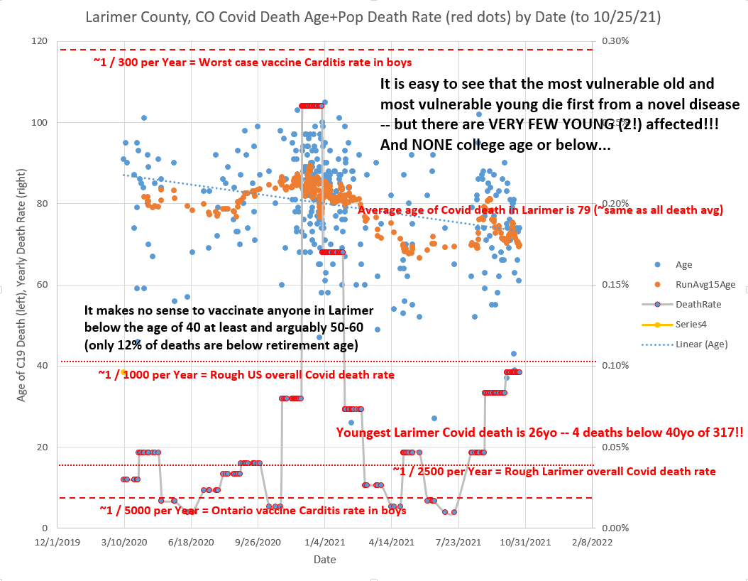
The youngest Larimer Covid death is age 26 and there are only 4 deaths below age 40!

That looks like this:
FACTS derived from the chart:
If you are college age and below in Larimer, your risk of Covid death is ZERO. Not even 1 in a million like lightning strikes but actually ZERO.
If you are under 40 your seasonal risk of Covid death is about 1 in 100,000 which is about 10 times lower than your risk of dying in a car accident.
If you are pre-retirement age your seasonal risk of Covid death is similar to or lower than your risk of dying in a car accident.
The Ontario vaccine carditis rate1 ALONE in boys and young men (girls are much lower) is in the range of the lower monthly seasonal Larimer Covid population-wide death rates that of course are mostly driven by the elderly — and the highest carditis estimates are above the highest Larimer monthly Covid death rate peak!
And neither do vaccine passports make sense anywhere since anyone awake now realizes Covid can spread even more readily among the vaccinated. Many of us have now had direct experience with this fact.
Anyway, blow it up and zoom around — my added text pretty much covers it all. (You can download the Covid deaths data from the Larimer County Covid website here.)
The X axis is the date — simple enough.
The left Y axis is age of death and that applies to to the blue and orange dots. The orange dots are the average age of the last 15 deaths and the dotted blue trend line is the trend for the average age of death which has now converged on 79 which is the same as the overall population age of death as you would expect over time if Covid has a death age profile similar to other netted causes of death.
In other words, death in general and Covid death as well is a phenomenon of the old and sick.
The grey/ red dot line and most of the red notations are for the right Y scale which is yearly death rate % due to Covid calculated for Larimer on a monthly basis hence the “stepness” of the grey line/ red dots. It turns out that Larimer has an overall yearly death rate from Covid only about 40% of the US national average so lucky to be you living here with generally low BMI and active sun-worshipping vitamin D fortified people.
It’s easy to see that when there are a lot of people dying from Covid (mostly elderly obviously) that the Covid death rate line in grey spikes — and this is a winter/ seasonal phenomenon in CO just as the flu is. In fact, if you go to the CDC’s FluView web app you can see that they have now added a mode that displays Covid together with the flu + influenza on the same week 40 to week 39 seasonality scale! They just won’t tell you that when they appear on CNN. (There is also a tropical seasonality sub-pattern for the southern states which has caused Florida to recently drop and currently have one of the lowest case rates in the US which you may also not hear about on CNN.)
But if you are confused by seeing population yearly death rates of only fractions of a percent that is because you have been conditioned by the TV to think things are far worse than they actually are. See my “9% Uncorrected” for perspective on what is really going on when you turn off the fear propaganda.
And turn off the T.V.
Very often you have to look around the world — in this case Ontario — to find useful data since the CDC is in a continual game of hide the football with the data. Note that of course being a carditis case does not mean you will die — but carditis in the young is VERY unusual and is not to be taken lightly and can certainly lead to significant medical costs including the need for heart transplants if not eventual death. I highly recommend this Dr. Campbell video interview on the topic of carditis.