

The Euromomo 3% PIC Calamity
What happens when flu/PIC seasonality is applied to Euromomo?

In my occasional fits about the level of corruption in the US data I sometimes look to Euromomo as less corrupted than many — who knew?
But one of the issues with Euromomo for flu and C19 analysis (together reported as “PIC” now according to the CDC if you’ve lost track of which shell the pea is under) is that it does not have a flu season (week 40-39) charting or calculation mode — so that view of the situation must be reconstructed with some data take-off.
What happens when you do that?

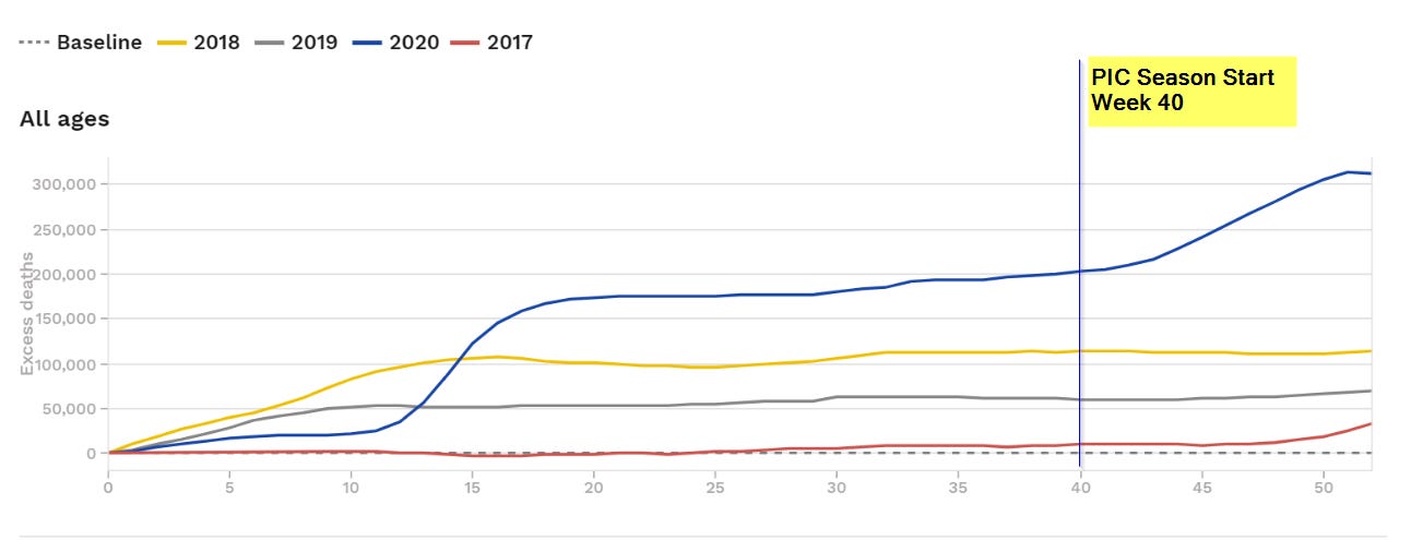
You find that the 2019-21 PIC season caused a 3% increase in total seasonal deaths over the most recent 2017-18 “bad flu season”. You know, the one that had a lot of local newspaper headlines about triage tents that everyone pretty much ignored?
You can do the visual check on this yourself using the Euromomo cumulative chart by looking at how far the blue line is above the yellow line at week 40 (about 90K) and then note that the red line that forms the start of the 2017-18 season bumps up after week 40 by about 20K. So adding that to the yellow line leaves about 70K difference to which you still need to similarly add the 10K bump in the gray line leaving about +80K.
And the new 2020-21 season is still below the 2017-18 season with deaths plateauing at least for now.
This is very much in line with some analysis that @MLevitt_NP2013 did a while back.
Seems totally fine to destroy our children’s future, wreck our small businesses and bankrupt our countries over that to me. /s

NOTE: PIC = Pneumonia + Influenza + Covid