

Stairways to Heaven: 2022 Christmas Edition
Time for a long overdue update

First, here’s an animated gif of the first chart in my last “Stairway to Heaven” post in late September compared to the latest data from HMDB I downloaded Christmas Eve:
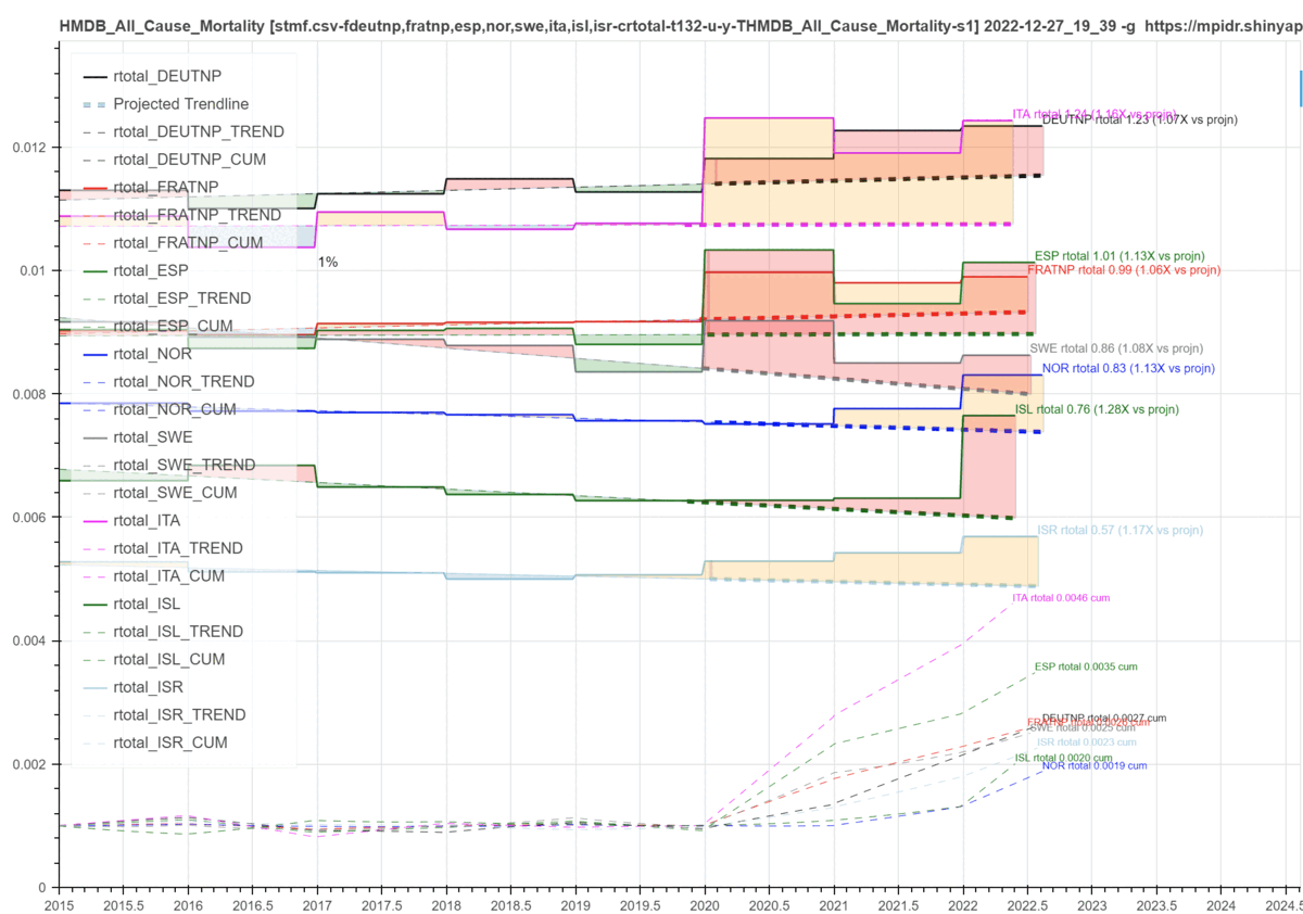
Obviously, the one that stretches out longer is the latest. And since this chart is configured for year long death rate steps — or year to date proportional in the case of the current year (2022) — and the fact that excess mortality reporting by definition has some reporting lag, we see that many of the 2022 “stair steps” except for Norway and Germany have some degree of reduced height since the added fall months are not the peak winter respiratory deaths period yet.
But if the injections worked, 2022 should be strongly trending everywhere to the minimal dashed trend line deviation coloring of the left half (pre 2020) of the chart.
It. Is. Not.
And no, these are not un-injected deaths forming the bulk of what you are seeing. See especially my last post to understand what the injectables are actually “accomplishing”.
EXTRA CREDIT:
This death rate chart format is a unique way to look at excess deaths that takes into account any trends in death rates that a country may have been previously experiencing. The heavy dashed lines are linear projections of the lighter dashed linear trend fits of the recent pre-2020 years. Here this stands out particularly in the case of Sweden (SWE).
In this view, Sweden actually does not look quite as good compared to Australia as is shown in the default on the HMDB chart app that I presented previously. But when you create this type of chart comparing them directly you find some interesting things:

First, before Fauci struck, Sweden was on a long term death rate decrease trend that was closing the gap with Australia and Norway which are coincidentally the paragons of the pandemic according to Bill Gates. And while Bill’s bullshit may have slipped by your radar a year ago, it’s not looking so good now as AUS and NOR death rates are rising up to nearly match if not eventually overtake SWE. Hmm. Did I forget to mention that even though Sweden has sadly become highly injected, it was one of the best countries regarding the initial acquisition of natural immunity? And did you go read my last post on the injectables yet?
And while (Mengele-)Fauci succeeded in killing large numbers of Americans out of the gate in the US, it appears that the US is now significantly lowering the toll rate this year very possibly due to a lowering injectable uptake? We shall see…
And yes, the long trend death rate “winner” labeled “DEUTNP” at the top is Germany with its country-wide N95 masking and all. Germany is one of the few countries in Europe with a sustained population wide death rate above 1% — Covid or not!
Related, did I forget to mention that masking is a joke also? Pigpen remains undefeated even in the face of world-wide tribal virtue signaling by the “zero everything” death cult — just as you knew he would.