
Sadly Still Stepping Up That Stairway to Heaven
If the injectables work, then why don't they?

With all the posts going around about recently if not continually increased all cause mortality (see farthest below in addition to recently lowered natality as I have posted on quite a bit lately), I have finally taken the time to herewith update my “Stairway to Heaven” series using the latest data from the Human Mortality Database (which while still containing various lags due to country specific issues is significantly updated now from my last post). Go back and read that last (relatively short) link for the decoder ring to this post.
Things continue to be quite depressing in the EU area as we can see here:
The key addition to this chart type for the current post is that I now auto-calculate the increase (or decrease if only there were any) to linear 2015-2019 all cause mortality trend lines and place that in the ending parentheses for each country label. So for instance for Iceland (ISL), we find that the 2022 death rate year to date is 1.28X of the recent historical linear trend line projection (28% above shown as “ISL rtotal 0.76 (1.28X vs projn)“)! Not good at all needless to say.
And sadly, the lowest above trend percentage on this entire chart is 6% for France. Note for perspective that France’s total population YTD death rate of “0.99” means that it is just a tick shy of having a total population death rate of 1% which shows as “0.01” for 1 part in 100 on the chart Y axis scale.
Please note that this chart is in a total population average death RATE format so not only are the relative increases against baseline for each country valid but the RELATIVE POSITIONING of each country’s lines and trend directions vertically are very revealing. For instance, even with crazily increased death rates, Israel as a relatively young and demographically growing population still maintains roughly HALF the total population death rate of older and demographically declining Germany and Italy which even pre-plague were (along with the US) on a trend to higher death rates!
Speaking of the US, if we clean out some of the middle of the pack countries in the previous EU focused chart for clarity and insert the US we get this:
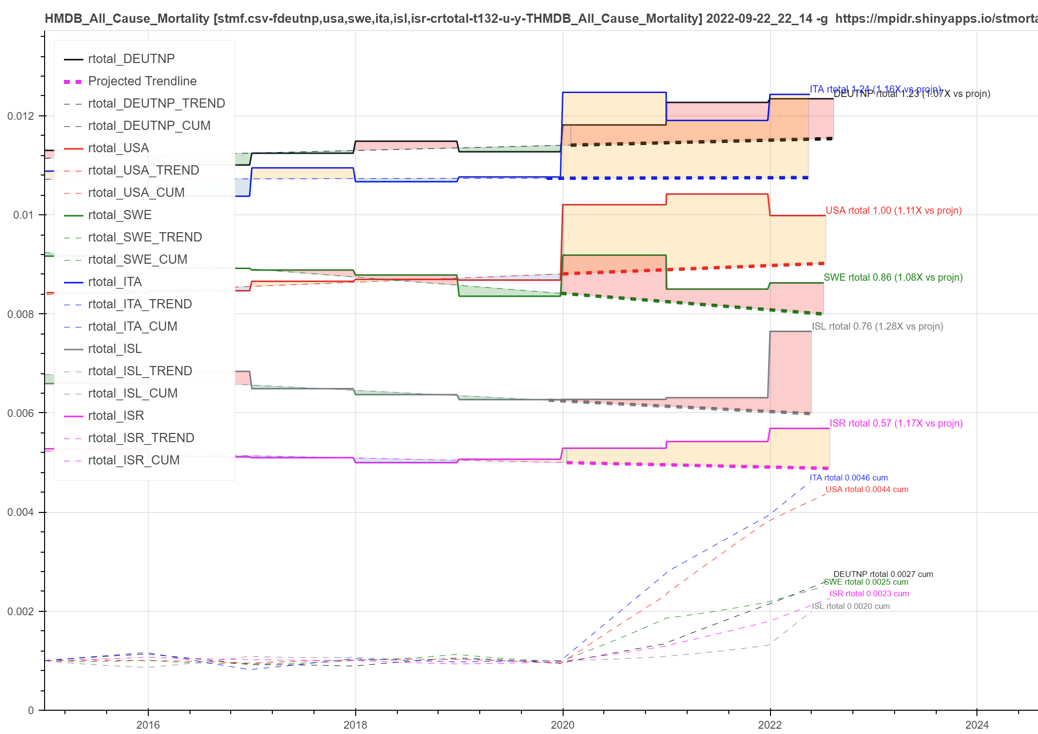
At least the US has a stairstep down from 2021 to 2022 but we are still 11% YTD over what was already a crazily increasing base death rate trend so not much joy to be found in that consolation unfortunately. In fact, of all the countries I have shown here, the US has by far the steepest pre-existing death rate rise ramp starting from around the time of Obama’s election. Hmm…
As I’ve noted before, it’s now incredibly unsurprising that our oh-so-ethical public heath autocrats in the US conveniently forgot to inform us of our pre-existing death rate ramp to heaven that they then started building stairs on top of with plague profiteering and fear. Which then our oh-so-ethical Fed is now using as an excuse to crash the economy on a path to who knows what fearful next disaster to scare the sheep with? Never let a good crisis fail to spawn the next one while slathering the ruling classes’ pots with stolen wealth as the penultimate priority after all…
And no, this is not about C19 anymore even though they still desperately want you to believe that. Please follow the adventures of @EthicalSkeptic for timely updates on the depth of the data laundering at the CDC:


MORAL OF THE STORY:
“We hang the petty thieves and appoint the great ones to public office.” ~ Aesop

