
Seasonality 201: Euromomo Edition
A look at applying virus seasonality to Europe

After our interesting look at C19 seasonality zones in the US and their clean mapping onto CDC’s FluView web app, it seems appropriate to see how it maps onto Euromomo which is the EU-wide excess death site traditionally aimed at tracking the impact of the flu.
That looks like this:
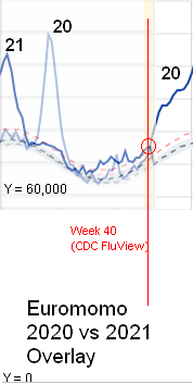
In this chart I have done a transparent overlay of 2021 to date on top of 2020. Since 2021 is not complete, the 2020 line is a lighter shade than 2021 until the end of 2021 data and then becomes dark blue again after the 2021 overlay ends with its light yellow incomplete data zone.
Also note that I modified the chart so Y = 0 (deaths) is clearly positioned. What Euromomo shows you by default is a form of data misrepresentation (non zero based charting) that makes things seem worse than they really are to the novice chart reader.
Since Europe is heavily biased to temperate seasonality (relatively small Spain is the main tropical zone driver since Italy only reports a small amount of its population to Euromomo for some reason) it’s hardly shocking how in 2020 the fall/winter deaths took off right at week 40!
And now we are watching to see how the (month+ lagging) data comes in for 2021 re fall/winter. (finger tapping sounds…)
Some interesting observations:
There was an elevation of deaths in 2021 at the same time in spring when the brutal initial C19 spike hit in 2020 — but barely noticeable in comparison to 2020.
2021 deaths in the summer are clearly elevated compared to 2020. Not a good look for the vaccines — what happens this fall and winter will tell the tale. (However, this is not to say that there is no summer “tropical” drive from Spain at all if you look at its individual Z Score chart near the bottom of the Euromomo chart page — and there were somewhat surprising summer spikes in 2020 in Belgium and Netherlands that may have been more the traditional European summer heat wave deaths in the elderly due to their general lack of A/C compared to the US…)
(more finger tapping sounds…)