One Mortality Chart to Rule Them All
A Christmas preview...

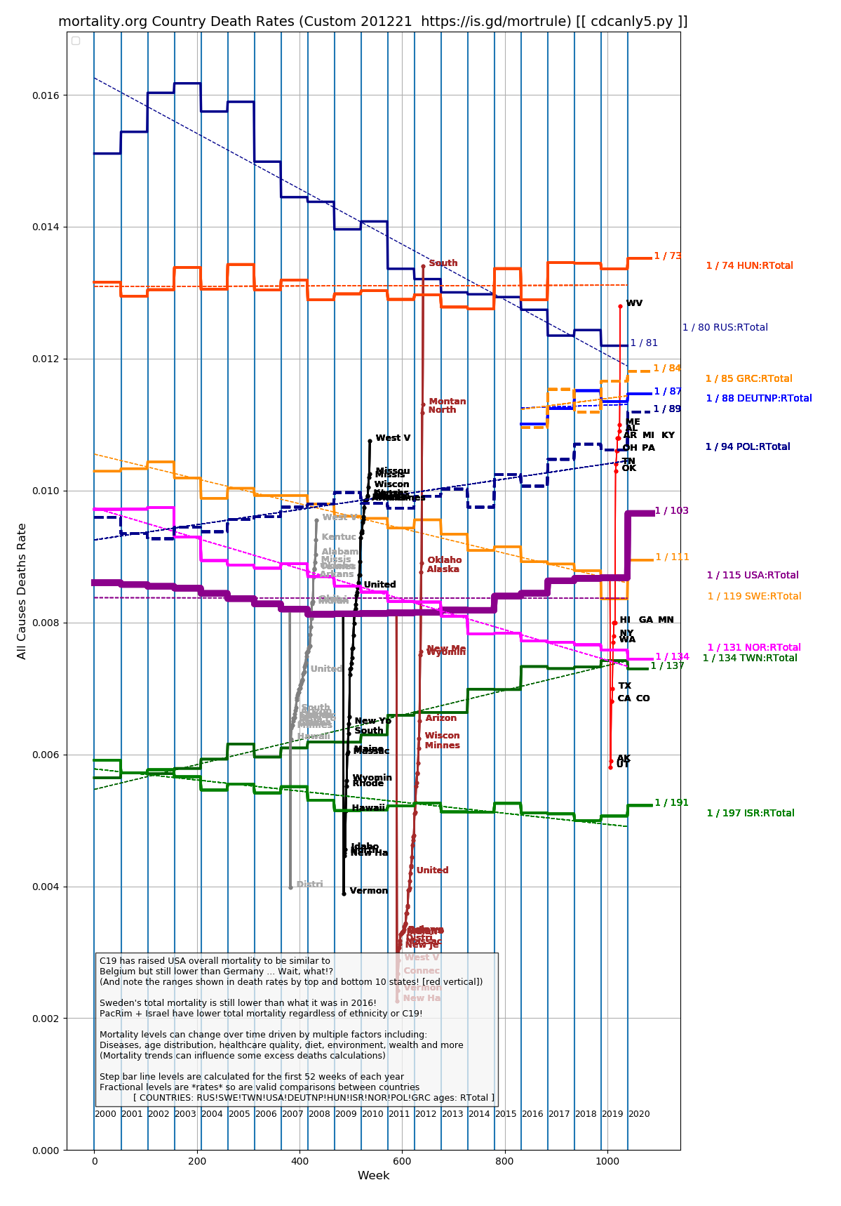
Just dropping a preview look before I start to comment in more detail in the next few days.
Mainly this shows mortality rate trends for select countries for the last 20 years or however much data mortality.org has for the countries that it covers and is a variant of my chart here.
But I have decorated two other interesting data sets on it:
On the far right is a red line with the mortality rates of the top 10 and bottom 10 states from Wikipedia so you can see how much variance there is. This lead to my post about the lethality of Maine.
In the middle (placed there for readability; they are actually for 2018) are lines with the recent US mortality rates by race from the Kaiser Family Foundation with grey for white, black for black and brown for other (can be dominated by hispanic, asian or native american depending on the state) with the top and bottom 10 states labeled. The values they give seem questionable to me on a absolute basis but somewhat reasonable on a relative basis.
One “starter” that leaps out is that similar to other investigators it looks like Sweden’s death rate has only been set back to 2016 or so by the virus. Where were the cries of doom from Sweden in 2016? Bueller?
And look at the “guardrails” of Hungary and Israel. This might lead the unsuspecting to realize that birth rates can have an impact on death rates, no?
The “0.010” Y line near the middle is a rate of 1% of the population dying each year which intuitively would make a lot of sense if everyone lived to be 100…