Masking Midwest Mask Madness
Masking Midwest Mask Madness
Should have posted this earlier...

This one is a great example of a deceptive infographic that I posted on twitter but should have posted here as well as a follow up on my “Flu Latitudes”.


Here’s a direct copy of my marked up version of the deceptive infographic.

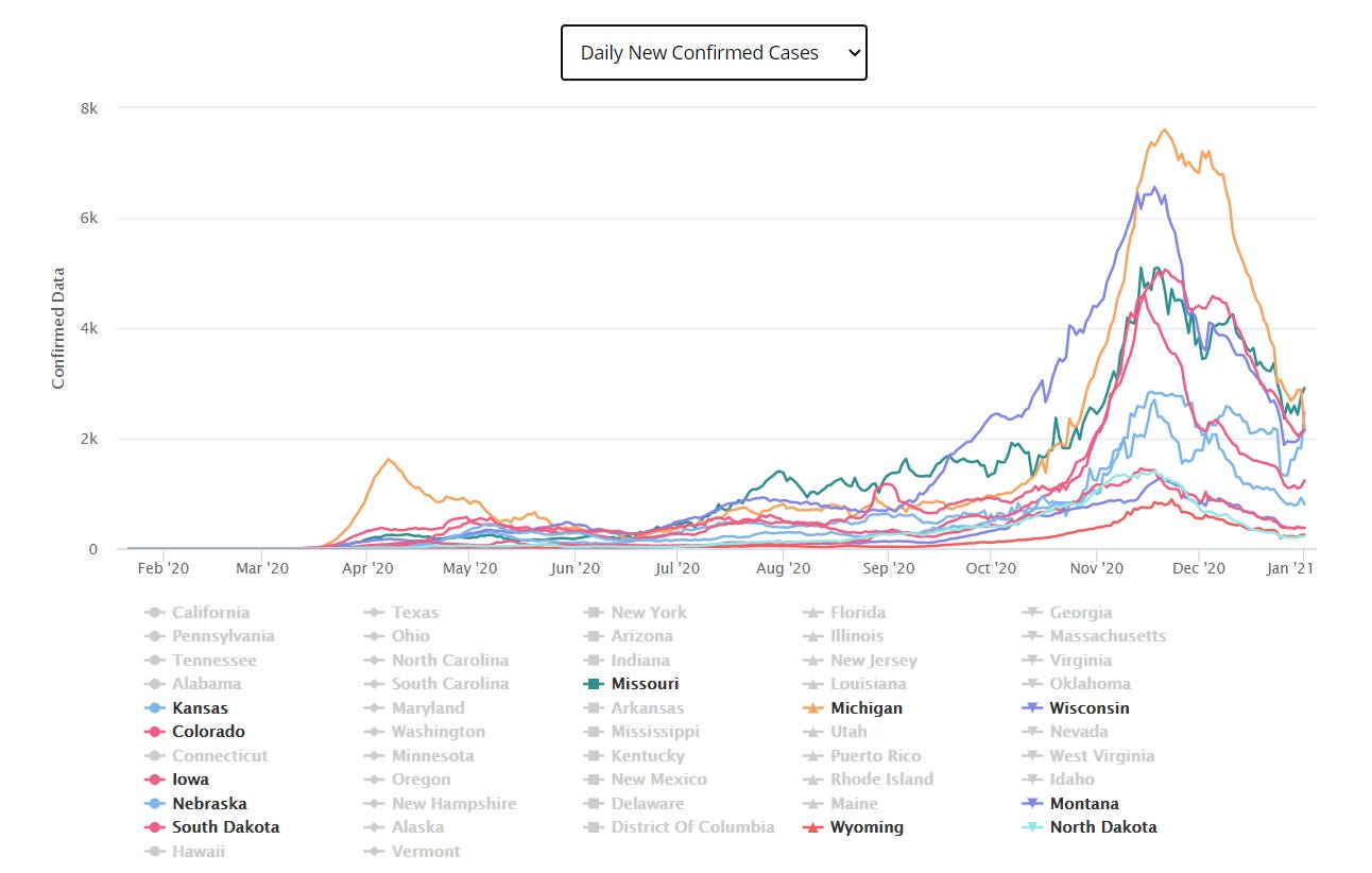
In the state heatmap chart I show in my tweet it’s obvious that the Midwest (blue is best) had been first through the traditional “flu season” and had “rolled over” on hospitalizations and was now doing relatively well. This is exactly what you would expect in terms of seasonality progression starting from the beginning of flu season at week 40 (early Oct).
But in the info graphic they show only mask status and you have to hunt through the mini case charts to figure out which states are missing and therefore doing relatively well. Yes, those would be the ones circled in green by me — the same blue states from the heat map.
Most people would not have the patience to figure out what states were missing in the mini-charts.
And thereby they make it harder to find that the states that were improving — all very similar curves BTW — had a mix of mask mandates hence throwing shade on mask efficacy.
And the Midwest case rollover continues. The question now is whether there will be a late season resurgence…