

(High) Correlations
How does a heatmap of VAERS deaths ages compare to my Larimer County C19 deaths heatmap?

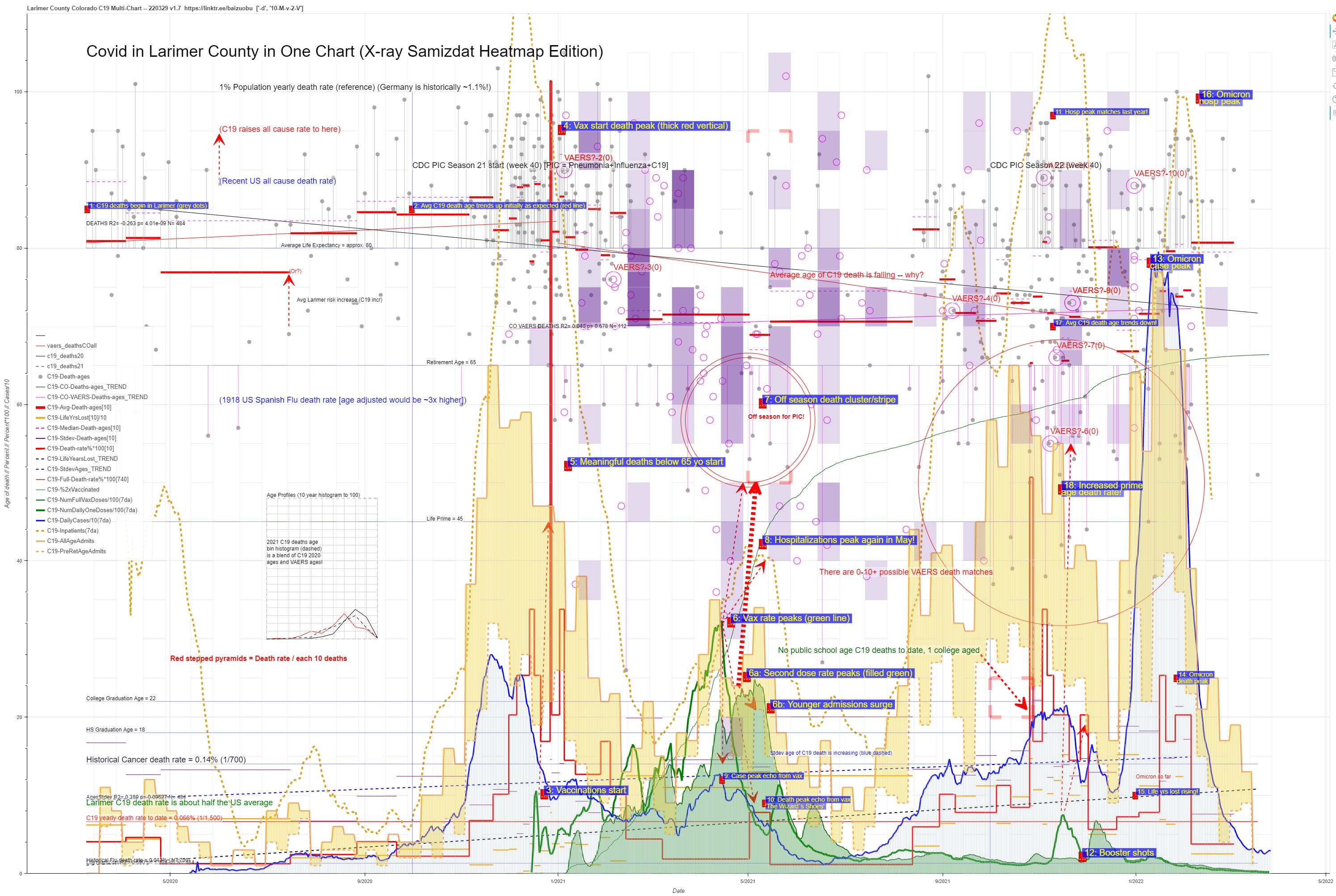
After my last multi-chart on Larimer County, one might wonder how the death age heatmap presented there relates to reported VAERS deaths in Larimer?
VAERS data is not available to county granularity and with its under-reporting levels we wouldn’t see many anyway. In previous charts, my matching algorithm came to the conclusion that somewhere between 0 to 10 of the 100+ Colorado VAERS deaths were matches for what we see in Larimer county though we can’t be sure. But this makes some sense since if you average that to 5 you get 4-5 percentish of CO VAERS deaths in Larimer and Larimer is about 6% of CO’s population. So not wildly off given the deliberate data obfuscation we are trying to see through!
So if you look just at the CO VAERS death heatmap alone mapped on my chart (without the C19 heatmap) you get this (VAERS heatmap in purple):
NOTE: I am using only 4K charts in this post. This just means that if you want to read the text on them on a normal HD monitor you will have to go back and look at the non 4K versions in previous posts or get out your magnifier.
This actually makes a lot of sense as the VAERS deaths start focused on the over 65’s where the vax needles started with just a few at much younger ages (healthcare workers were also vaxed early). Then, as the vax rate peaked you see the ages of death drift down before drifting back up and smearing across ages in later 2021 and early 2022. The overall age binning of VAERS deaths skews younger as shown by the red curve in my inset age bin chart in the mid left. (Also note that the age of C19 deaths in 2021 in the inset chart [dashed black] is roughly an average of VAERS and the 2020 C19 death ages [solid black] which is also like you would expect if large numbers of C19 deaths in 2021 are actually vax deaths.)
I am still just showing Larimer vax curves — I will add CO overall soon but you would expect the vax curves for CO to be just a “time smear” of the Larimer one. Also note that I have left the May 2021 C19 death surge in ages 50-95 Larimer “red corners” on the chart for comparison — the surprising amount of spring purple basically just smears forward and backward from it as one would expect if the CO vax curves were less peaked as expected.
Looking at the purple in late 2021, my biased take is that this also reflects a building tendency for younger aged deaths NOT to be entered in the VAERS system or be pruned by the CDC. I think this is also driven by the lower, less peaky vax rates leading most actual vax deaths to be longer term ones that cannot be so easily correlated with the shots.
And here’s a version with both the Larimer heatmap and the CO VAERS heatmap each occupying half of each month for a direct comparison. It’s interesting but kind of goes over the “too busy” threshold even for me LOL. Some may prefer it though color hues kind of throw off the intensity comparisons for me.

More to come about mapping CDC age banded C19 death data for CO (and other states) onto this in comparison with Larimer but I thought I’d get this out there for the weekend…