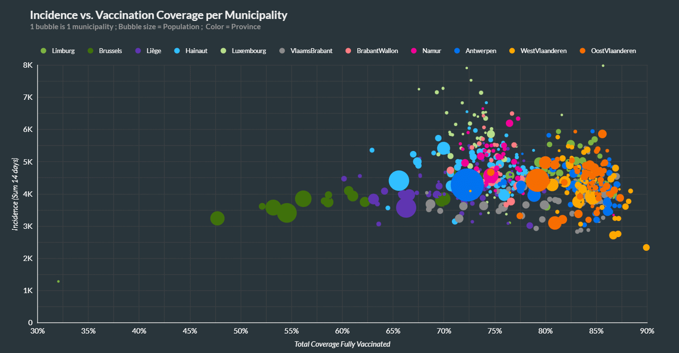
Just in case there remains any ridiculous troglodyte cargo cultish belief that vax rate pushes down case rates we have:
Yes, Brussels has the largest Muslim population in Belgium and hence those dark green dots off to the left with low vax rates. So explain to me why they don’t form a group up and to the left again?
This was published directly by Belgium public health itself (need to find the link again, sorry but it is real). If vaccines worked it wouldn't take much squinting to imagine a trend line through the bubbles from the upper left to the lower right (fewer cases [y] as vaccination rate rises [x]). All those green bubbles on the left are likely heavily Muslim neighborhoods in Brussels that wreck any imagined success at such a full chart width conjuring.
As far as I can guess, those neighborhoods are pretty densely populated and may be one of Europe's best approximations of the mucosal natural immunity that seems to have been achieved in shoulder to shoulder India with a relatively low vaccination rate. It's even more interesting if I'm wrong about the population mix of those neighborhoods but I don't think so...


Need far more guidance and clarification about the chart.
This was published directly by Belgium public health itself (need to find the link again, sorry but it is real). If vaccines worked it wouldn't take much squinting to imagine a trend line through the bubbles from the upper left to the lower right (fewer cases [y] as vaccination rate rises [x]). All those green bubbles on the left are likely heavily Muslim neighborhoods in Brussels that wreck any imagined success at such a full chart width conjuring.
As far as I can guess, those neighborhoods are pretty densely populated and may be one of Europe's best approximations of the mucosal natural immunity that seems to have been achieved in shoulder to shoulder India with a relatively low vaccination rate. It's even more interesting if I'm wrong about the population mix of those neighborhoods but I don't think so...
Brilliant, and a purty infographic!