

Charting Alex Berenson's Latest All Cause Mortality Concerns
Here are his newly posted concerns about European excess mortality in simplified "stairway to heaven" chart form

Alex Berenson just put up a substack pointing out that at the level of population excess mortality, many highly vaxed European countries — regardless of the proportion of actual Covid deaths making up the excess — are not trending well.
My recently updated excess deaths charting capabilities (in this case of total population death RATES for valid country to country comparisons) using Human Mortality Database data (as debuted here simplifying an earlier “sine wave base” version here) are well suited to make a simplified view of what that looks like for (from top to bottom in the chart) Germany (DEUTNP in black), Portugal (PRT in red), Spain (ESP in grey), Netherlands (NLD in blue) and UK (GBRTENW in green):
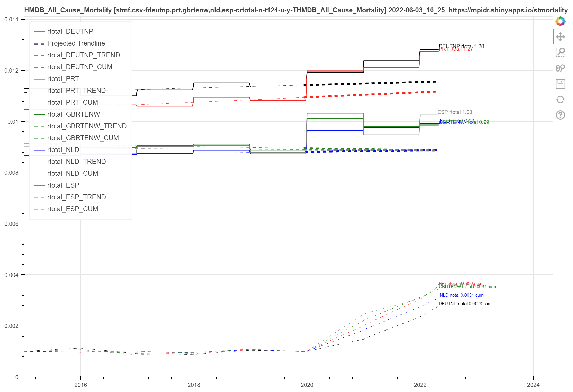
The dashed lines starting at end of 2019 and extending to the right side are where the death rates should be varying around if the trends from 2015-2019 had continued. Understandably (other than all the “lockdown enhanced” Covid and other deaths exaggerating things in 2020) one would expect that if the vaxes were effective we would see the step up we do in 2020 followed by steps down back toward the projected trend lines in 2021 and 2022 with the deployment of the vaxes.
Other than in Spain and UK where there were at least temporary steps down in 2021 we don’t see that! We see continuing steps up in all cause death rates for 2021 and YTD 2022.
And the dashed cumulative excess death trend lines toward the bottom of the chart should be flattening in confirmation.
But they aren’t since the steps keep forming a literal “stairway to heaven”. Ugh.
Stairway to Heaven is particularly apt.