
Danger Will Robinson!
The Human Mortality Database all cause death rate trends are pointed in the wrong direction compared to what vax advocates would have you believe...

I did some previous charts driven off of data from the Human Mortality Database but those are now quite aged. An especially notable finding was that Germany’s all cause total mortality rate was actually higher than the US never mind most other countries — and this is true both pre- and post- advent of Covid — so on an overall death rate basis in spite of the propaganda you actually remain safer in the US than in Germany!
That is, even with the US government killing the Covid vulnerable and society’s marginal members as fast as they can with ventilators and Remdesivir (err, “run death is near”) to lower future entitlement payments so the politicians can better sustain their lifestyle of graft (for instance, it’s best to simply think of “foreign aid” as political money laundering as the Biden crime family has illustrated in plain sight), the US has still not been able to overcome Germany’s overall population death rate for the world crown! (Historically this turns out to be true — even in 2019! — because Germany currently has a sizeable relative “pocket” of frail elderly feeding higher death rates than other countries such as the US.)
Listening to the panopticon vax propaganda machine, one could be forgiven for expecting with wide scale vax injections that at least the all cause death trend lines would have turned down now regardless of any potential “poll position” changes such as the US vs Germany.
One would be wrong Kemosabe — except for Sweden they keep trending up beginning in 2020 and alarmingly so… In the cases of Norway and Israel things even look to be accelerating! Dare I mention that Pfizer has publicly proclaimed Israel as their “laboratory”?
Not good. If things were as the propagandists would have you believe, we would see steps up in 2020 as we do but then we would see stair steps down in 2021 and 2022 as the vaccines started to work. WE. DON’T. SEE. THAT. Except for “those granny killing Swedes” the stair steps are GOING UP.
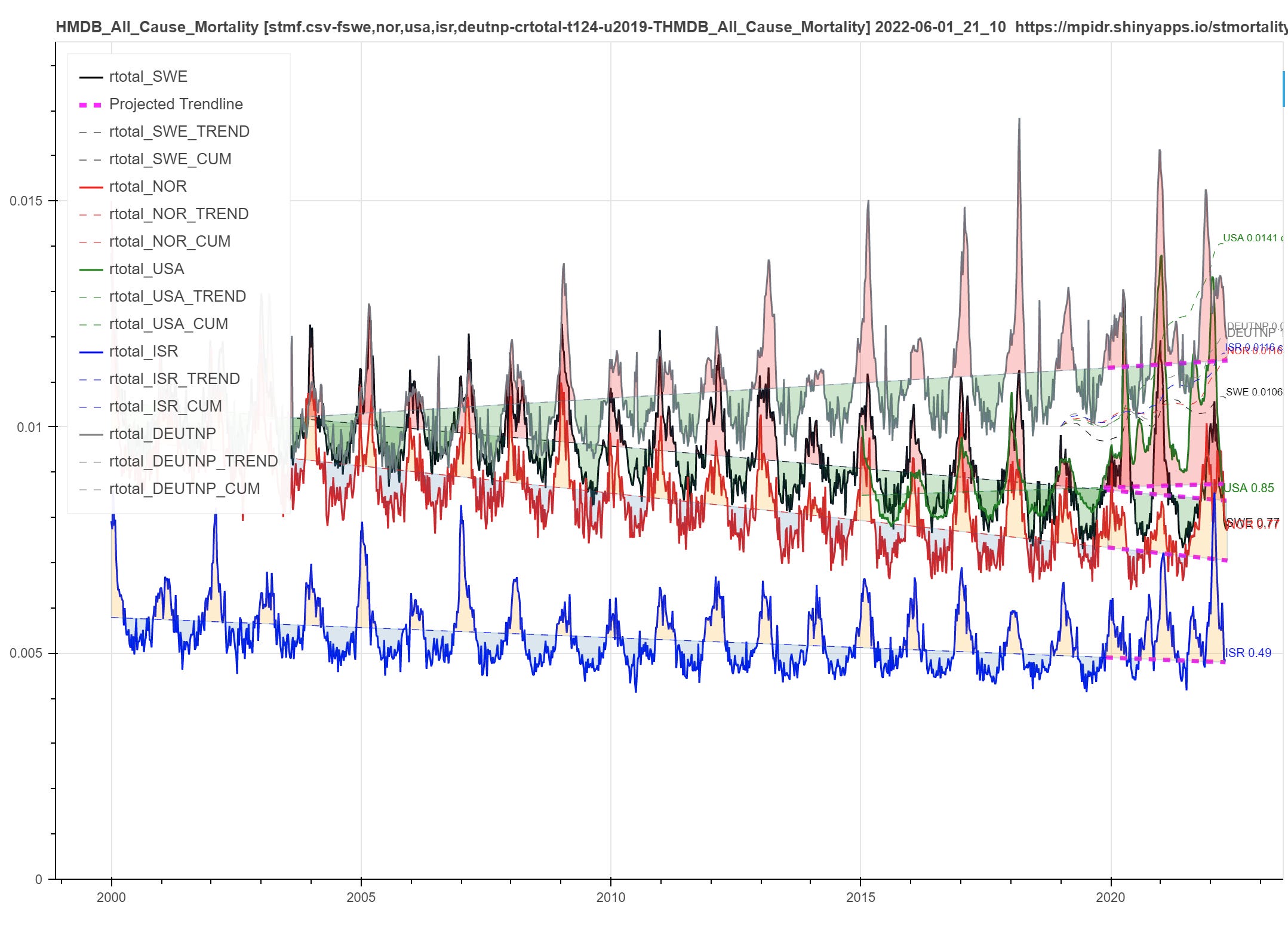
(DEUTNP is Germany, USA is obviously USA, SWE is Sweden, NOR is Norway and ISR is Israel. This is a yearly smoothed step chart to make it easier to understand — see the weekly chart toward the end of the post to understand why I gave you this one first ;)
These are zero based linear trend lines for *all cause* mortality of which Covid is just one contributor (the all cause list is primarily driven by “heavy hitter” causes such as heart disease and cancer for instance, which in spite of the dishonest propaganda and fake tests have never been outgunned by Covid). The advantage of focusing on all cause mortality is that it is much harder to “game” regarding levels as opposed to the well known insanity of for instance PCR testing Ct level manipulation. And since these are total population “rate” lines they are valid comparisons *between* countries when overlaid on the same chart scale.
If you look carefully, you can see that both the US and Germany have also had long term trends toward increasing death rates even pre- Covid — somehow Dr F forgot to mention that regarding the US didn’t he? And Sweden, Norway and Israel have long term down/ improvement trends until Covid hit.
Some observations:
I have already commented on why Germany’s trend line is so high — but why is Israel’s so low historically? Because Israel has a high birth rate and resulting low average total population age of around 30 compared to most other western countries being near 40 or even above. Lower average population ages will tend to drive these lines lower.
The comparison with Norway has been used to trash Sweden’s overall middle of the pack general European Covid death rate performance in spite of a its general lack of NPIs compared to other European countries. But note that on all cause deaths Norway has *always* done marginally better than Sweden (Sweden’s long term trend line runs higher in parallel) for non-obvious reasons … *and* now notice that Omicron’s recent advent in Norway has accelerated them to be comparable to or even worse than Sweden on cumulative all cause deaths! Bet you weren’t expecting to see that happen were you? The dashed lines in the upper right corner are relative cumulative all cause excess measured starting in 2019 — note that Sweden is currently the recently achieved winner (has the lowest cumulative level)!
For those with sharp eyes, this chart uses a linear trend all cause base line rather than the more typical “multi most recent year” sine baseline. To achieve similar results to the multi year average sine baseline approach most commonly used, the linear trend for each country runs from the start of data to the end of 2019 and is then linearly extended though the end of data so the 2020 to current Covid data does not bend the trend (as some would argue) inappropriately. The heavy dashed magenta ends of the trend lines make this clear.
Here is the noisier weekly trend chart version as previously promised. Needless to say, it is better understood and explored with dynamic zooming which I have not enabled here.
And for an extra bonus cross check, if there were such a thing as, say, national “death services” revenue (e.g. funeral home revenue, etc.) collected on a long term basis by the St Louis FED might one expect its trend line to look a lot like this based on what I have been illustrating so far? Why, yes, yes it does:

One certainly wouldn’t expect at least the last two data points to drive that much red over the trend line if the injections were a miracle cure now would we?


But just keep watching the 24/7 propaganda panopticon and you won’t be troubled wondering why the ambulance sirens seem abnormally frequent over the last year in your area…