Ben Calculates (ASMR)
Thank you Ben!

I have been meaning to start covering Ben @USMortality ‘s recent implementation of age standardized mortality rate over at his recent site mortality.watch


This is a GREAT addition to the team reality arsenal that is also an excellent augmentation for my “Stairway to Heaven” posts as well as a way to decipher the fun I had with some older related posts like “But not as dangerous as Germany”.
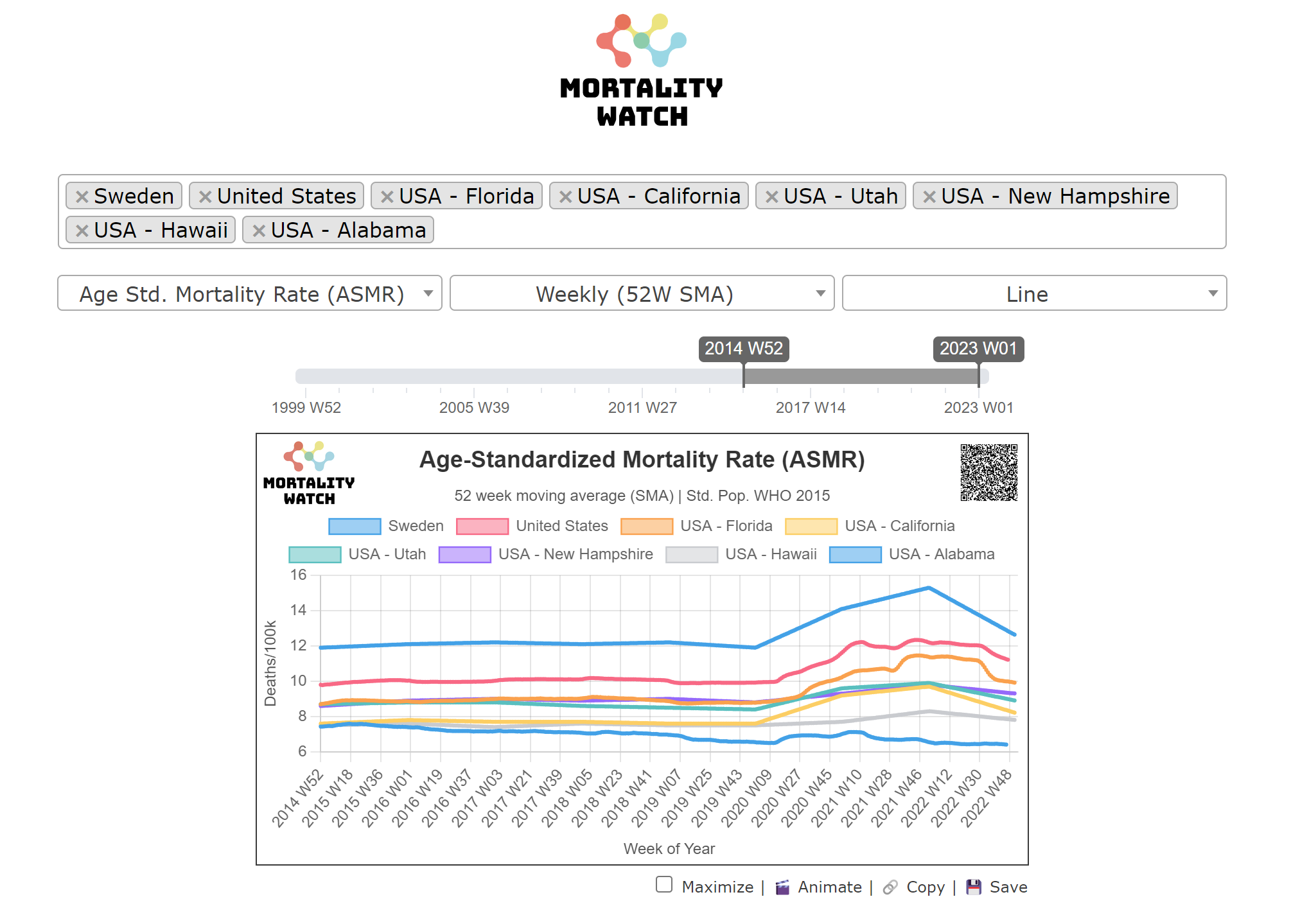
I’ll do more posts on this but I’ll keep this first one short and sweet by first just re-implementing my last chart in the last “Stairway” post using Ben’s ASMR mode as a 52 week moving average chart:

My comparable chart is this one:

The first thing you’ll notice is that the USA and Germany still have the highest rates but have swapped positions! And astute observers will also notice that Ben’s chart is not zero based like mine. Here is a marked up version of Ben’s chart to correct that:

Also notice that now it’s no longer Israel with the lowest current (age standardized) mortality rate (as in my chart) but Sweden!
Oopsie!
More explanations in future posts.
And thanks for grinding through implementing ASMR Ben!
Parting bonus: I can’t resist leaving you hanging with this one for later discussion also (that’s right, the lowest / best line on this chart is “all dead” “reckless” Sweden! ;)