

A Colorado Kid Corona Case Compare Continued
The seasonal sine starts subsiding? [UPDATED 1/23/2022]

(Sorry, not sorry the alliteration just wouldn’t stop ;)
It’s time to update “A Colorado Kid Corona Compare” — we can now bring the chart up to date through the week ending 1/16/2022.
With this past week’s data we can see the winter season cumulative cases curve flattening, which means the rates are falling which is of course good news. And given what we would normally expect for seasonal respiratory viruses1, we can hope that the winter peak is now subsiding — we will see…
And the argument that Douglas county just isn’t testing and otherwise would be much higher is weak sauce especially now that I have put the starting point for the non-Douglas county mask mandate on the chart. If you can find a contextual effect on any of the data for the three districts you will need an electron microscope to do it.
IN SHORT: Unmasked Douglas County schools continue to perform comparably if not arguably better on case counts than neighboring masked Cherry Creek and Littleton.
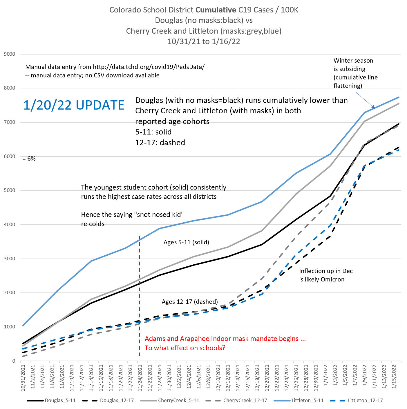
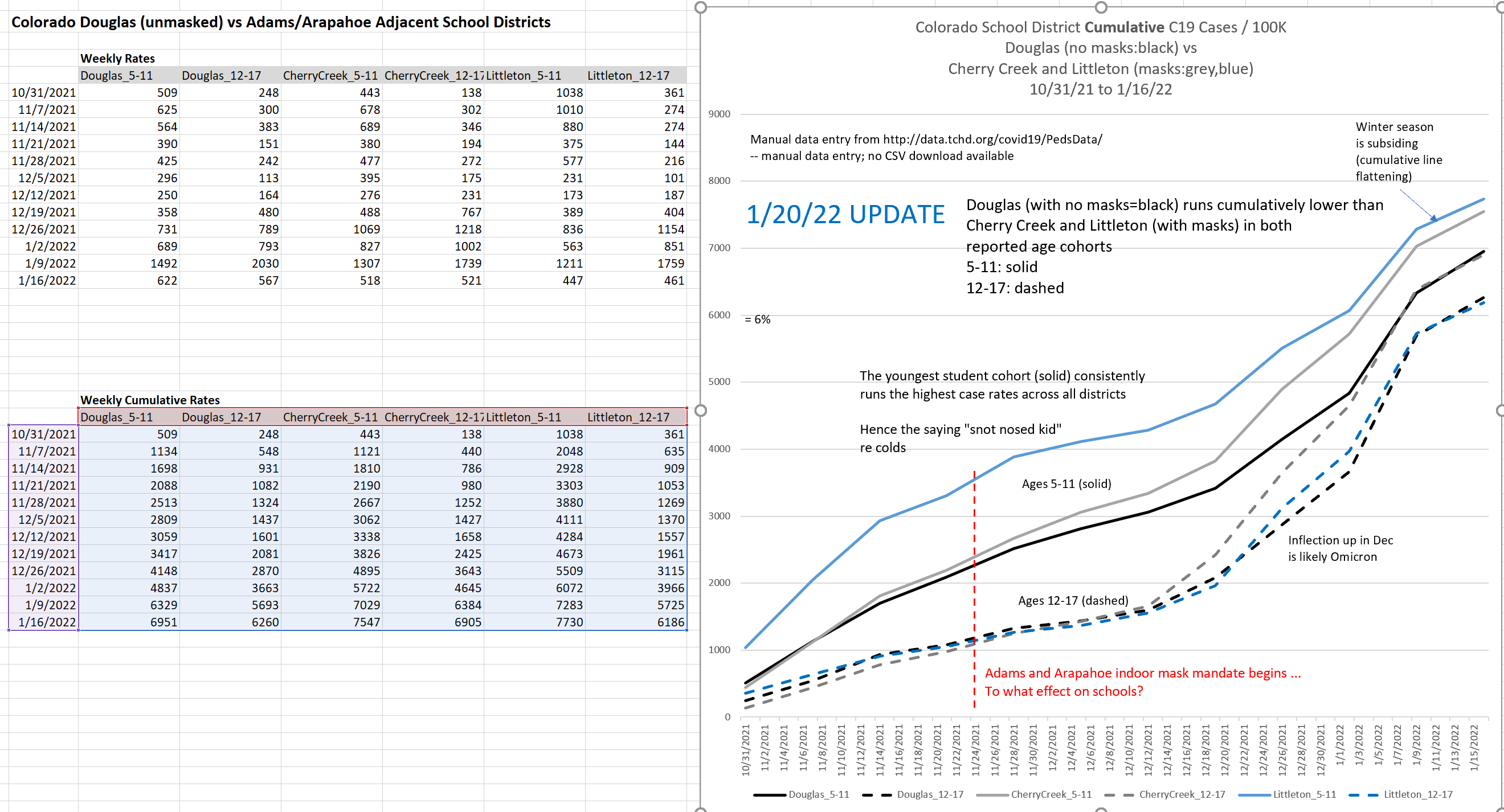
Here’s the full spreadsheet. Cherry Creek and Littleton districts were used as the compare since they are substantial and form the literal direct northern border with Douglas.
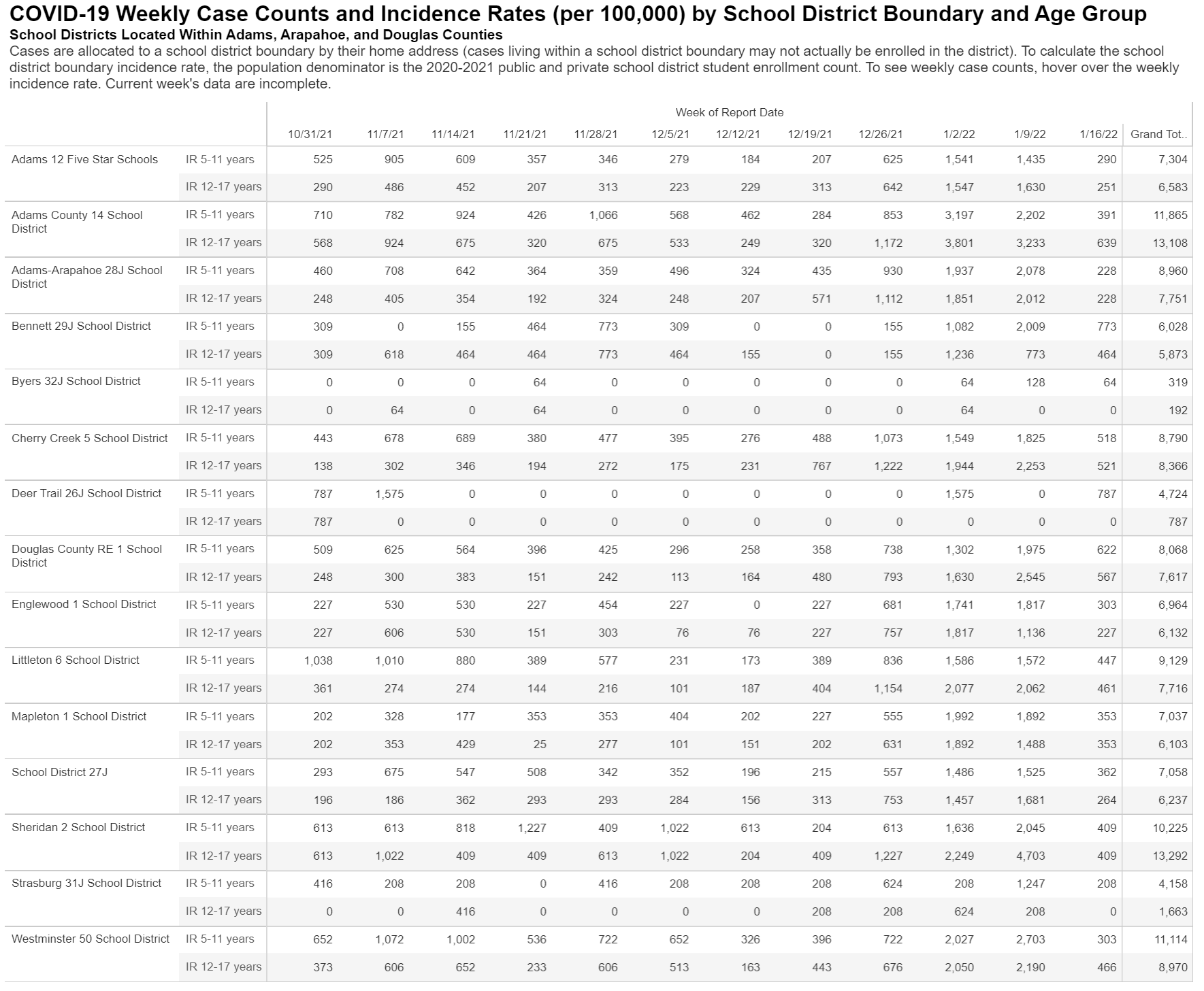
And here is the (non downloadable) data table from Colorado Tri-County Health that I have been doing manual entry from that has been updated for the week ending 1/16/2022. I snapshot it publicly here since I have no confidence they won’t take it down since I have exposed what they conveniently failed to chart.2
All you “snot nosed kids” out there are now free to check my work or do your own expanded version…
And Governor Polis’ “Kinsley gaffe3” of telling the truth about masking’s ineffectiveness based on his view of what’s happened in New Mexico (a bordering state) can now be considered meaningfully substantiated within Colorado itself using bordering counties.
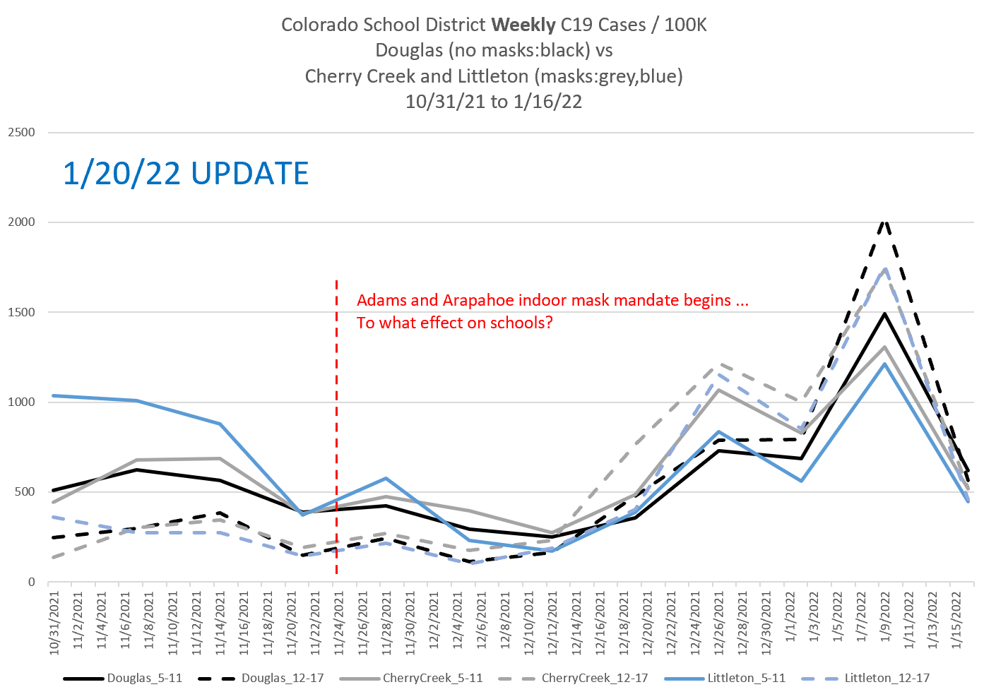
UPDATE 1/23/2022: Added the weekly version of the chart for comparison and also what Our World in Data shows for cumulative cases in the interval for 11/24 to 1/23 for the US.
Here is the weekly version. Nothing too surprising here — just makes it obvious how useful the cumulative version of the chart is.
For calibration, here is the Our World in Data site’s cumulative cases for the US for the same (a week longer) dates.
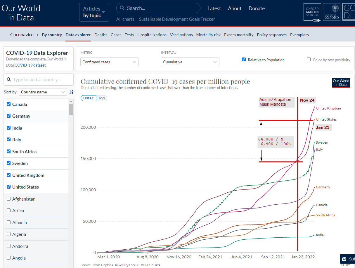
This comes out to 6,400 / 100K or somewhat less since the period on the OWID chart is slightly longer. This is in the ballpark of 6%. Now note that I had already tagged the “= 6%” level on my first chart as a rough ballpark of how many cumulative cases we had as a percent of the population.
So we are seeing kids in Denver area school districts run case rates very comparable to the US overall for the same period.
Masks or no masks it doesn’t make any difference.
You did know that the CDC added a C19 mode to their FluView web app a number of months ago and kept the week 40-week 39 seasonality? Now why would they do that if they didn’t think C19 wasn’t also seasonal? The only other option is the FluView app is junk methinks which leads us into a different ugly landscape…
Note that Alex Berenson caught Alberta “accidentally” (from their furtive standpoint) publishing data that was brutal for vaccine efficacy so they took the data down of course.
A “Kinsley gaffe” is when a politician accidentally tells the truth. Which is why Polis was immediately made to walk it back in large portion.