

Today's Samizdat Seasonality Charts
Israel, Palestine, US, Sweden mashup oh my

As bad cat noticed, Israel vs Palestine isn’t a very salubrious comparison for the vaxxes:

I have overlaid the fully vaxxed uptake timeline on the lines for Israel, Palestine and US cases (top) and deaths (bottom).
The moronic — soon to be Omicron with some letter jumbling (but never Xi) LOL — media would have you believe that if the US can just nudge a little further up to Israel’s uptake rate (well make that 98% according to Brandon) then all will be well.
The good news is that Israel has trended down significantly. The more interesting news is that next door neighbor Palestine (with half the uptake rate) has ALSO trended down and is now comparable to Israel!
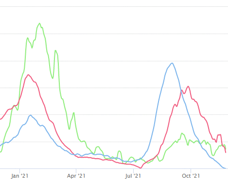
Say, did I forget to mention the bulk of the US south of CA (green), TX (red) and FL (blue) death profiles over the same period? Looks like some pretty similar timing to me on the other side of the world at similar latitudes…
Can you say seasonality? I thought you could…
And next let’s take a look at cumulative C19 and excess deaths to date and throw in Sweden:
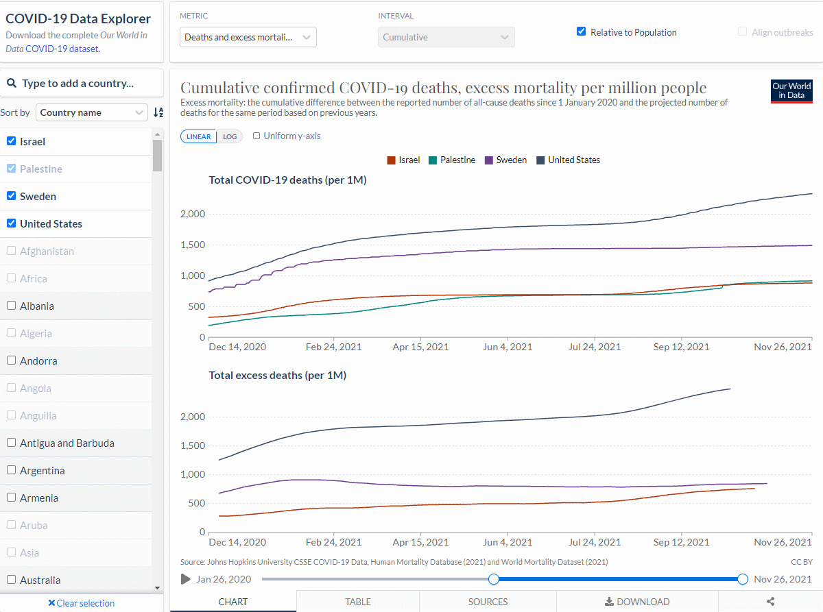
On C19 deaths to date, (now highly vaxxed but just came from behind) Sweden is significantly lower than the US though not as good as Israel and Palestine. Note the fact that I can just glibly throw in low vaxxed Palestine with Israel? Oops.
Note that these are cumulative charts so seasonality tends to get washed out in favor of total scoring.
And also note that on excess deaths the moronic media’s favorite charnel house Sweden is converging with Israel (Palestine apparently does not report excess deaths). Oops again.