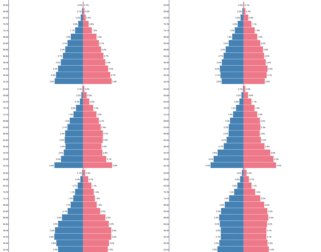
Many who have paid attention to the exponential age-based risk for C19 death have had the intuition that the boomers are contributing to the large reported death numbers. (Let’s hold aside how real the C19 numbers are for this tome.)
Obviously, the death distribution in Larimer County does nothing to dispel that.
But is boomer age cohort growth real and if so what does it look like?
How about an animated population pyramid of the US since 1950 for starters?
Bet you haven’t seen anything like this before ;)
Can you spot the boomer wave? That would be a yes.
Can you see it pushing into the retirement age brackets? Yes again.
And it doesn’t look much like a pyramid anymore does it?
In addition to watching the boomer’s “bulge” progress from bottom to top, it’s quite interesting to just stay focused on the tip of the pyramid to watch it rise and fatten. That increase from 57 and 68 to today is how you get to my age adjustments (on top of population adjustments and C19’s high average age of death) to realize that the fully population and age adjusted death toll from the 1957 Asian Flu was around 400K in today’s terms.
Where have I seen numbers that size recently?
What do the actual population impacts look like? Here’s the growth of the 65-79 and 80+ age cohorts since 1950:
You can see the boomers are growing the 65-79 cohort but not yet a visible growth uptick impact on the 80+. Overall these cohorts have gone from about 13 million to 53 million people — roughly a 4x growth and now about 16 percent of the population!
But if you look at the yearly change in people added to each cohort by 5 year bins (4 year for 2015-19 to factor out C19) you see that the boomer growth is attenuating — after a huge growth — in sub 80 but starting an effect on 80+
So it all makes sense including support for @FatEmporer’s “dry tinder” hypothesis.
The only part that doesn’t make sense is why we let ourselves be brainwashed into doing anything different than our parents did in 57 and 68 for what turn out to be quite comparable pandemics — which was mostly nothing.
This paper explains what’s really going on (“Covid-19 Mortality: A Matter of Vulnerability Among Nations Facing Limited Margins of Adaptation“):
Results: Higher Covid death rates are observed in the [25/65°] latitude and in the [−35/−125°] longitude ranges. The national criteria most associated with death rate are life expectancy and its slowdown, public health context (metabolic and non-communicable diseases (NCD) burden vs. infectious diseases prevalence), economy (growth national product, financial support), and environment (temperature, ultra-violet index). Stringency of the measures settled to fight pandemia, including lockdown, did not appear to be linked with death rate.
Conclusion: Countries that already experienced a stagnation or regression of life expectancy, with high income and NCD rates, had the highest price to pay. This burden was not alleviated by more stringent public decisions. Inherent factors have predetermined the Covid-19 mortality: understanding them may improve prevention strategies by increasing population resilience through better physical fitness and immunity.
Turn. Off. The. T. V.
Escape your house and exercise and get sunlight and lay off the sunscreen.
Take vitamins, especially D3.
Improve your diet.
And don’t forget to Turn. Off. The. T. V.


