

Sometimes you need to look overseas...
... to fully recognize the BS

Like this (thanks Steve!):


Not only is one of these waves not like the other but remember how I recently pointed out that they have converted the excess deaths sine wave amplitude plus flu deaths all into “PIC” deaths to sustain the big C19 death numbers? Where is the flu and many other viruses now in the virus surveillance testing? Poof, gone.
This chart is the perfect illustration of that for the UK:
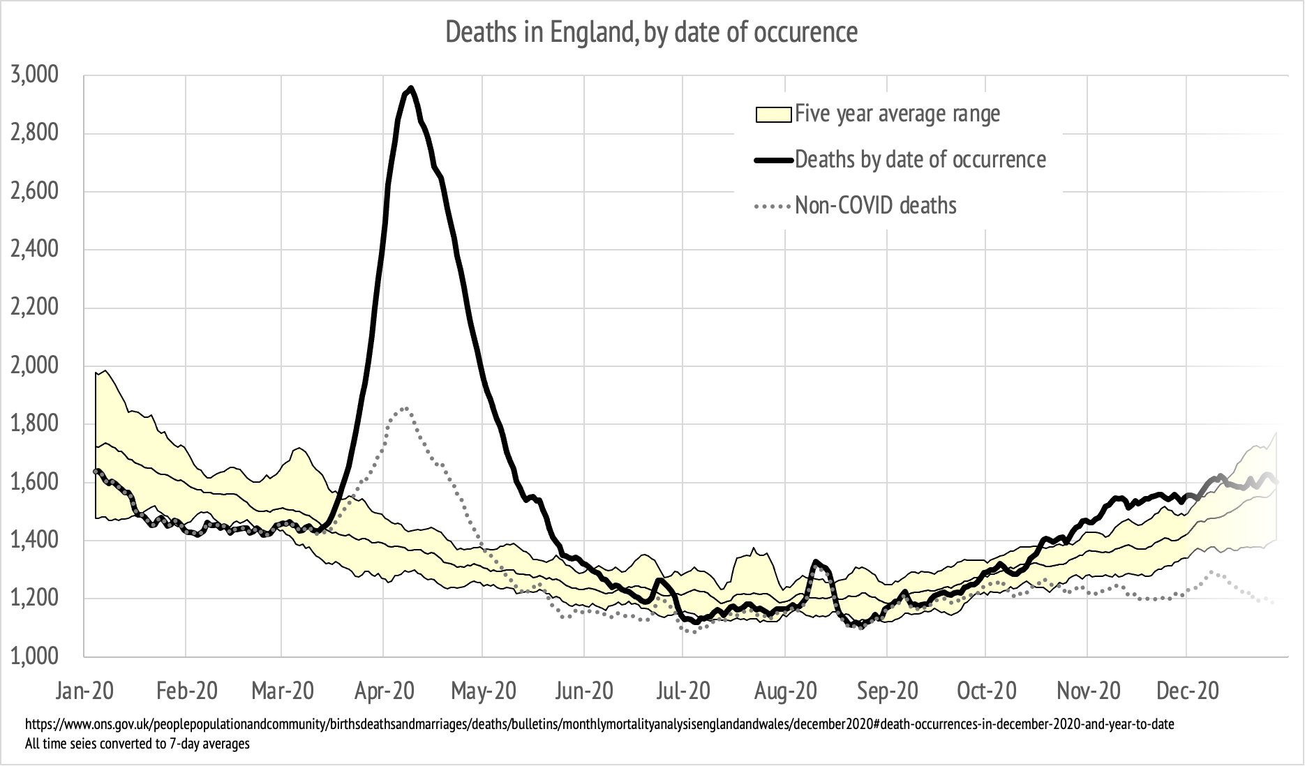
How? Like this:

LOL
It hasn’t even exceeded the 5 year average range by all that much.
And note that I made the red arrow start just as you would expect at week 40 for the start of the new “flu” season which they have now converted from “PI” (pneumonia + influenza) to “PIC” (pneumonia + influenza + C19) in the CDC reporting.
We can argue about whether C19 really has displaced most everything except an attenuated rhinovirus or whether they are still there but ubiquitous C19 testing reduces their detection. But the net effect is the same re the C19 scare numbers.
Yes, they are counting all the deaths that would have happened due to flu that typically make up the excess peaks and the many other viruses (including the 4 pre-existing cold causing corona viruses) that make up the base sine excess amplitude as C19 with corrupt PCR Ct infinity testing.
Because media propaganda seance, not science lets them get away with it.