

Oh Say Can You See
... the virus deaths on this chart?

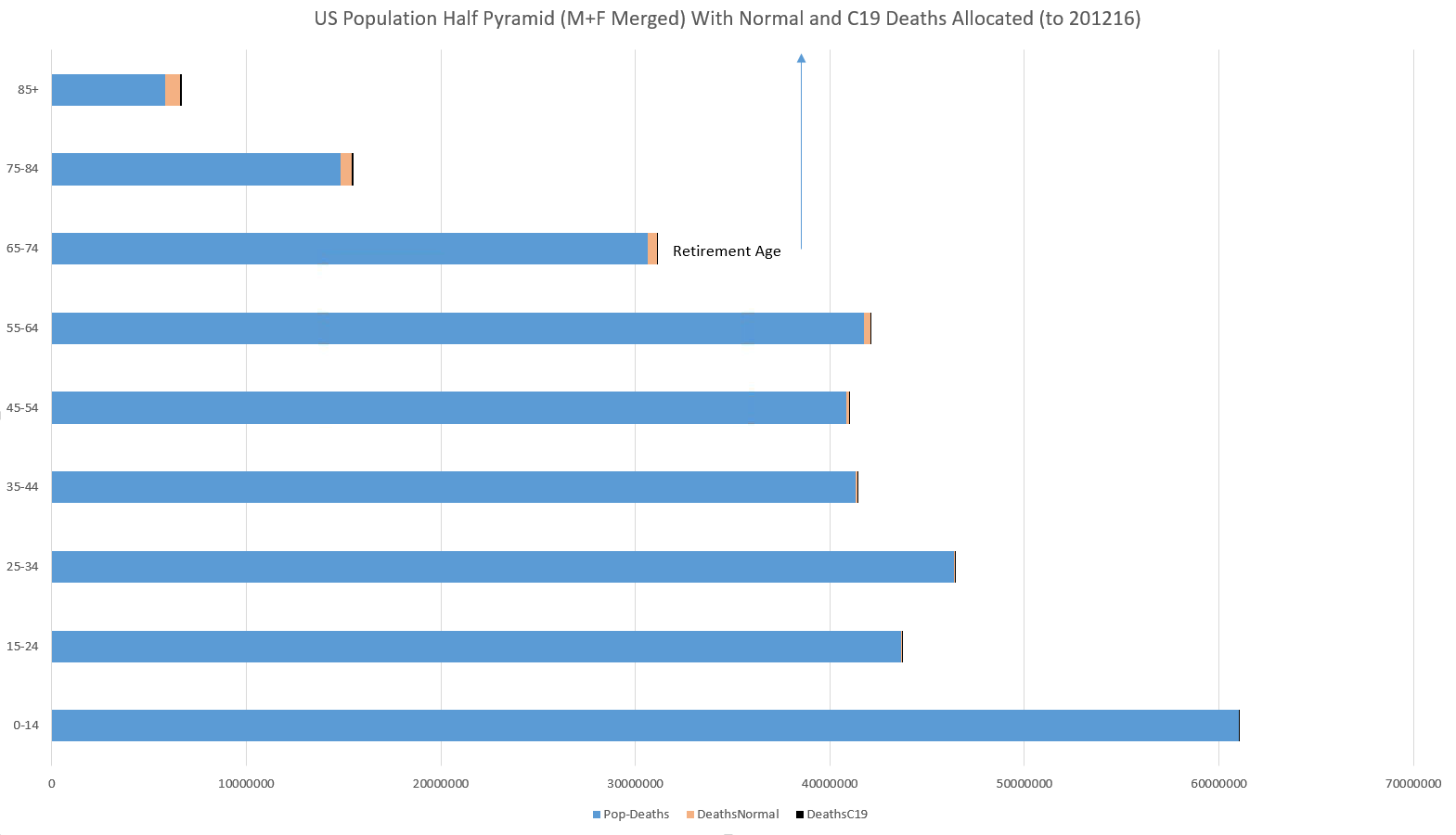
Here is a US population half-pyramid (M+F deaths merged) with both normal and C19 deaths allocated for 2020 to Dec 16. (I have been posting some work to split things out into CDC week 40-39 “PIC seasons” in other posts but this chart shows a worst case including nearly half of the new 2020-21 season to date.)
The black bar tips are a proportionally accurate visualization of the US virus deaths to 12/16/20 in relation to normal deaths (orange) and that age range’s population (blue). (Well, actually at the lower ages it’s an over-representation since Excel will always try to draw a pixel wide line for a non-zero value LOL.) You’ll notice that until you approach retirement age it is difficult to see even the orange of normal deaths never mind the black for C19 deaths — so be sure to click or pinch/zoom to blow this up.
That’s what a ~0.1% population fatality rate looks like that’s 80% born by the post retirement population with a median death age into the mid 80’s in most locales especially like Larimer County, CO.
Panoramic post-modern multimedia fear propaganda is a powerful thing, isn’t it?
Here’s what that data table looks like with an “odds of death” for C19 and normal life as well as how much the addition of the added C19 risk has increased your normal risk of death.

Hold your hands 9” apart and then move them to barely over 10” apart.
That’s your pre-existing and new risk of death even for the at-risk retirement set.
But to do the same depiction for kids, your hands will shake more than the hand movements required!
So CDC director Redfield had a politician’s “Kinsleyan gaffe” when he admitted at a hearing last summer that children had a 1 in a million risk of death from the virus. A Kinsleyan gaffe being defined as when a politician accidentally tells the truth that he is not supposed to say out loud. For the purposes of our discussion here the difference between 642,519 and a million is plenty of accuracy.
Turn. The. T. V. Off.