
Major VAERS Carditis Update
Major VAERS Carditis Update
Multi-mode chart with data through Dec 17, 2021

One VAERS carditis chart to rule them all. (Ignore the grey “record gap” spikes for now other than to notice there was a significant pattern change in 2021 which bears further investigation. Also note that I am for now ignoring the VAERS under reporting factor which is likely somewhere in the range of 4-40.)
The annotations on the chart cover things pretty well, but things to notice that are all as predicted by Team Reality are:
This is the first chart I have seen to incorporate previous year’s VAERS data on carditis. In this case I have only gone back to 2012 (of data back to 1990) for readability and sufficiency to establish a pattern. Note that carditis reports this year so far are 183x higher than recent previous years!
You can see just as expected in April and May as the average age of carditis falls (red/blue average age lines mid-way up; congruent with the opening of vaccinations to younger ages) that carditis events down to 16 year olds and then 11 year olds start.
In the far lower right we can now see carditis events for ages below 11 yo as those ages are now being vaccinated.
In the far lower left there is an age profile chart of carditis events where it is easy to see that young males have a hugely disproportionate risk compared to young females. Hence why the Nordic countries have at least stopped Moderna (which has the highest carditis risk of the major vaccines) for younger ages.
I will add breakdowns for individual vaccines and more but I wanted to get this out there for now…
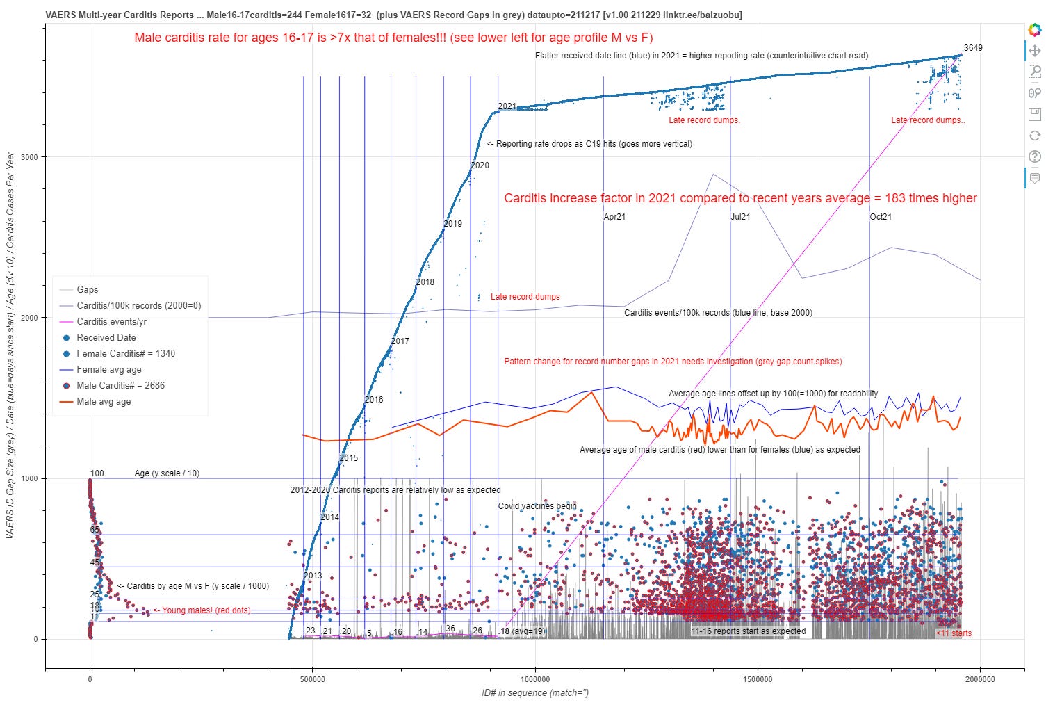
The lower third of the chart has carditis events with age on the Y axis divided by 100 to scale it for readability. The lower left is a separate horizontal age histogram chart also with M/F red/blue breakdown by sex — and wow is that proportionately ugly for boys just as what data has been made public by health authorities shows (usually grudgingly).
Note that this chart is a bit counter-intuitive as higher event rates are actually indicated by more “flatness” of the heavy blue date line since the x axis is actually organized by sequential VAERS ID numbers. And that also explains why the chart starts at x = ~450K as that is where records start for 2012 as opposed to the 1990 start of VAERS data at 0.
Related to this, about 2/3 of the way up is a blue line for carditis event count per 100k records which has a 0 base at 2000 on the chart so you can see the event counts related to the visual “burstiness” of the dots.