

Germany All Dead Redux
Incoming series preview

You might want to go back and look at “The Curious Case of Already All Dead Germany” and “But not as dangerous as Germany”. But they won’t quite prepare you for this:
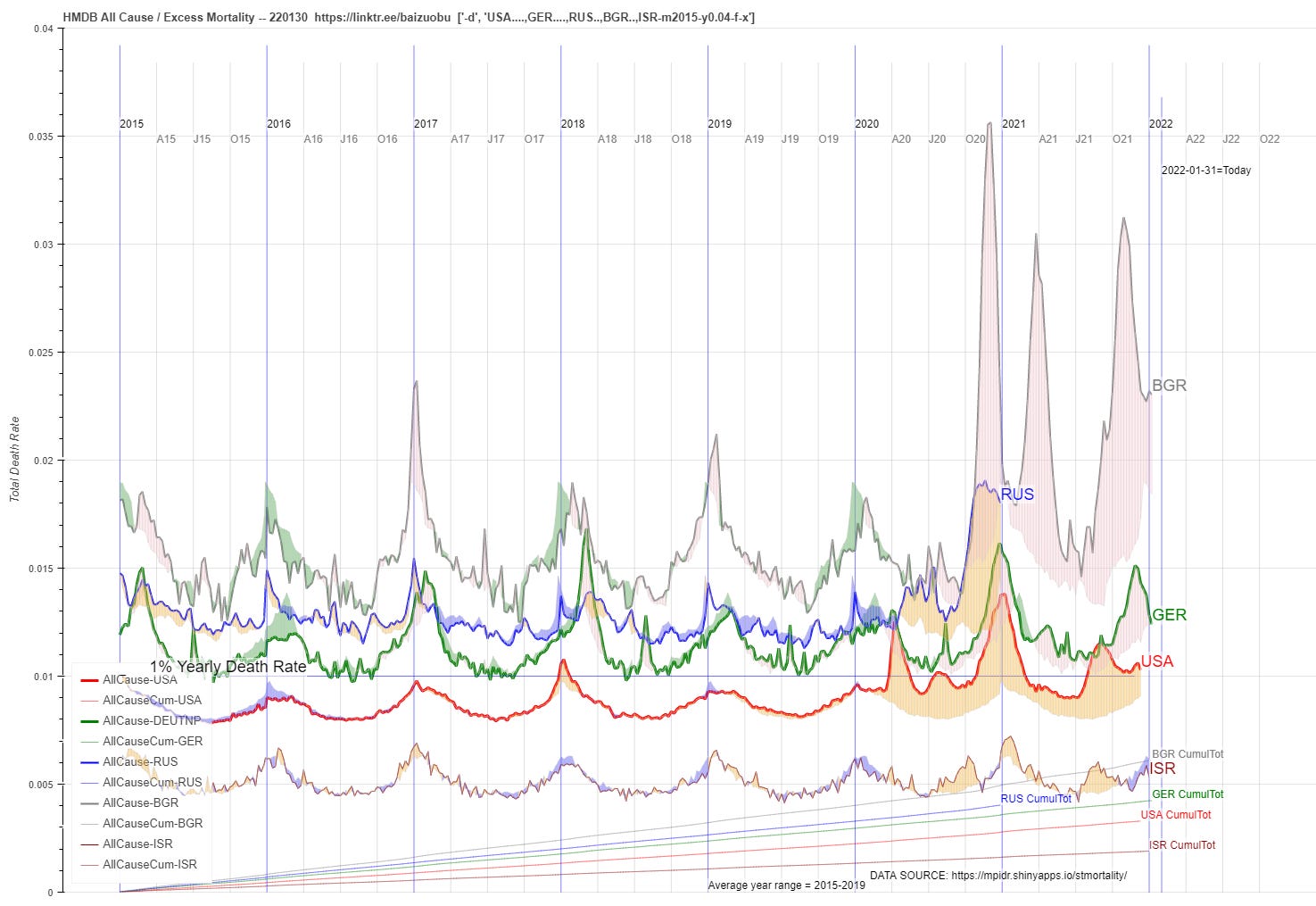
Needless to say there’s going to be lots of exploring with new visualizations of the HMDB database that their site’s simple applet just can’t do ;) So download and code we have!
Yes, all the visual “eyeball” comparisons you want to do on this chart are valid as this is all rate comparisons on a linear, zero-based scale.
And here’s a 4K monitor version if you have one:

While they are doing a great job of elder genocide in the US, it still remains true that they still haven’t been able to catch up to Germany — never mind Bulgaria — on an all cause deaths basis.
And needless to say, just look at how low Israel’s total all cause death rate is … which we will be exploring as well…
One more teaser:

Yes, on this one — rates for total population as well as age bands that draw lines below its vector — I have even added an “odds of death” scale if you look carefully.