

Colorado and (why) the Excess Sine Wave
People who were about to die are dying in Colorado! Larimer County also! And democracy is dying as well!

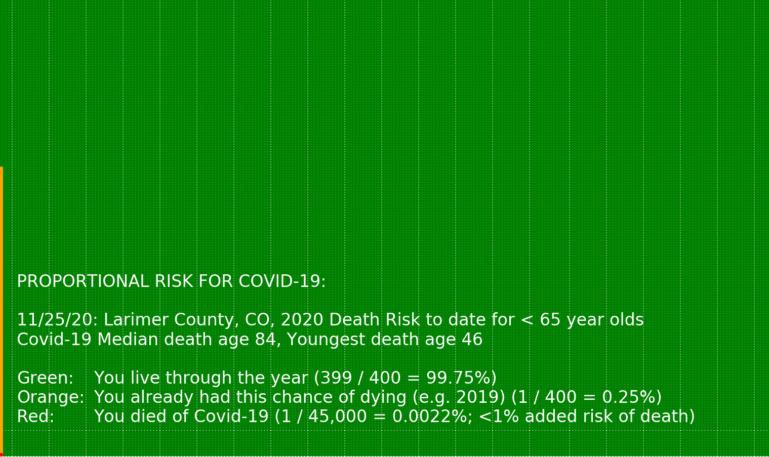
Since my last update on Larimer County we have had 8 more people die here — the average age was 85 and the youngest was 73. So my chart for pre-retirement risk of death is unchanged. I’ll let you search for the red danger zone again until you finally find it:
I also pulled down the latest CDC excess by age bracket chart for Colorado:
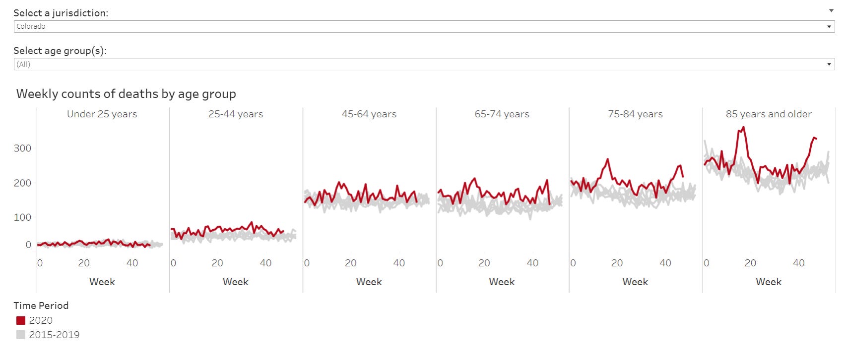
Status of worrying about age brackets:
<25: Sheer insanity
<45: Umm. Maybe we should have thought about it in summer a bit is all?
<65: Silly
<75: We can talk but you might lose the argument all things considered
<85: Yup: the latest few week’s Larimer (8) deaths have an average age of 85 so math
+85: Ditto and 3 of the 8 were in care homes
Did I forget to mention that the average care home admission even pre plague had a life expectancy of 6 months?
And here’s an insight that will put you miles ahead of the other virus researchers given the context of my last Rileyesque musings about the complexity of the viral stew: Notice how the sine wave shape of the all causes/ all ages charts is formed by the 65+ crowd’s deaths — and only a fraction of this was officially tagged onto the flu in the olden years before the plague!
There are many who argue that the bulk of the sine now is modulated by the virome. Obviously the flu portion is. Rushworth points to a reference that colds can be more deadly than flu for the frail elderly. And who did I just illustrate drives the sine?
Speaking of the latest top level CDC excess chart:

We have something hiding in plain sight here. Notice how even the “bad flu year” of 2018 doesn’t show all that much excess and that’s all there is for 3 years? I haven’t done the programming yet to calculate it but what do you suppose the number of deaths in the gap between the orange threshold and the green bars integrates to since the start of the chart? Maybe 300-400Kish? And maybe 150-200Kish in 2019 alone?
And how large is that blue again? Can you say “dry tinder hypothesis”? I thought so.
Yes, I know I’m pushing the numbers envelope by using the excess line blindly — is it excess? substantial excess? — but provocation is a thing from me ;)
Cherry on top: I started integrating the size of the sine wave above the trough values in my CDC multi-year overlay chart today and came up with 193K for 2019 as an example. Consilience.

As an extra bonus for my age bracket arguments above, note how much lower the light black dashed 2014 all causes line is than the heavy black dashed 2019 all causes. This is yet another angle on my population adjusted all causes trend chart below that shows rising deaths since 2009. So on the Colorado chart’s fuzzy gray you can mostly safely assume the increment of any rises above it are to be measured from the top of the gray and not the bottom!
Finally, here’s a version of the Colorado excess chart from a few weeks ago that I decorated with graphic representation of the relative populations of the age brackets. Yes, the >65 population is only 12%.
They’re holding everyone else hostage.
Democracy.
